
Client: Grupo Bimbo · Donuts® Design: In-house design department
The commission came from the in-house design department at Grupo Bimbo, the world’s largest baking company, and it began with the client’s own assessment: the images Donuts had been using were not doing enough to convey the freshness and naturalness the brand wanted to project.
The brief came with one rule: the bite. And it was not a styling device, it was how we proved three different things with a single gesture: the softness of the crumb, the break in the sugar glaze on the Glacé, and the fracture of the Chocolate and Fondant coatings. A different proof in each variety.
We began with the packs. Rebuilding the packaging images first meant solving the photography against the constraints of the pack from the very first frame: the product had to sit inside a graphic composition that already existed, with its wordmark, its corporate yellow and its allotted spaces, and hold up to the reproduction demands of print.
With that language settled on the pack, we were commissioned to shoot a second series: the donuts photographed from different angles and in different positions, built to carry the new concept and the new product image across the rest of the brand’s communication.
The images are used today across every one of the brand’s channels, from the pack you pick up off the shelf to the bus shelters on the street.
A body of work that keeps growing.
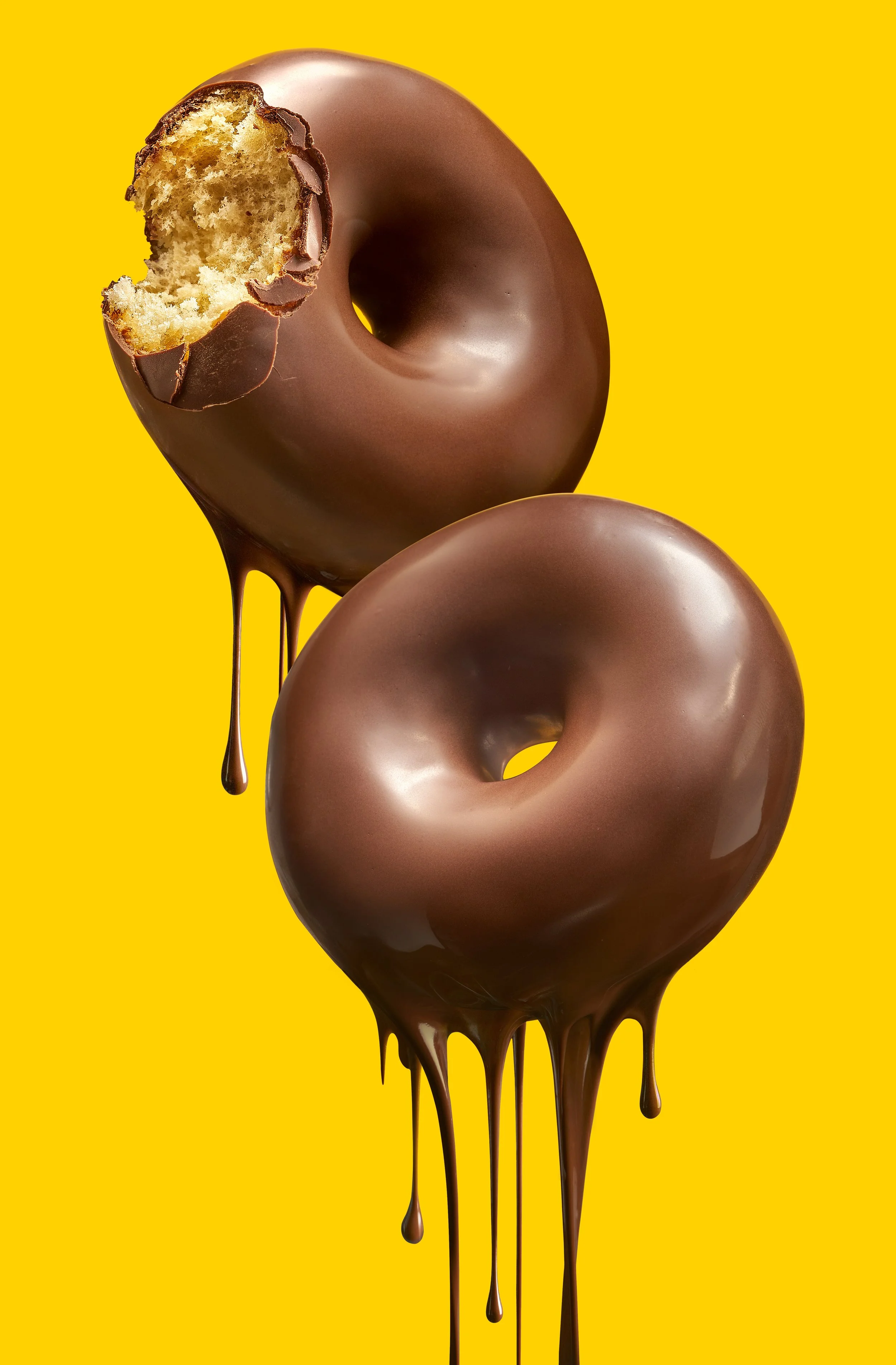
Donuts Bombón duo
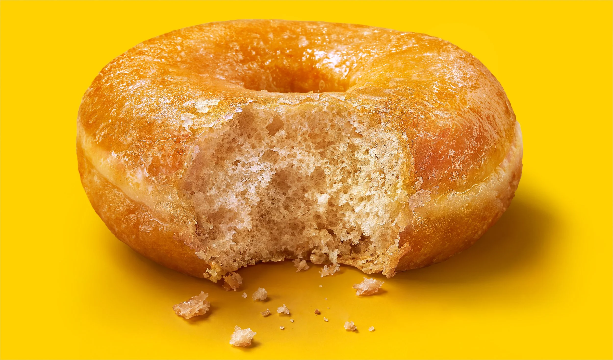
Donuts Glacé
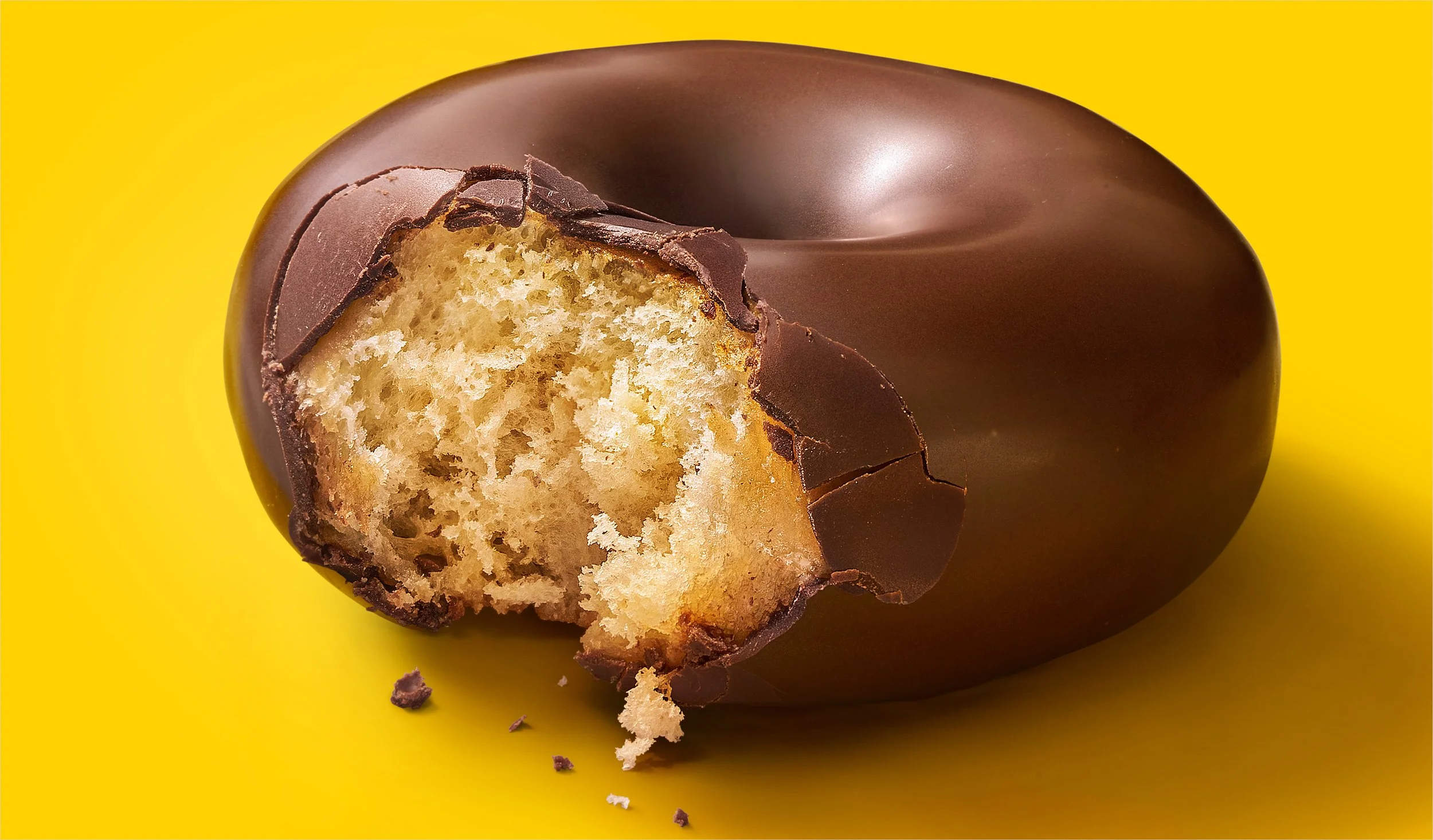
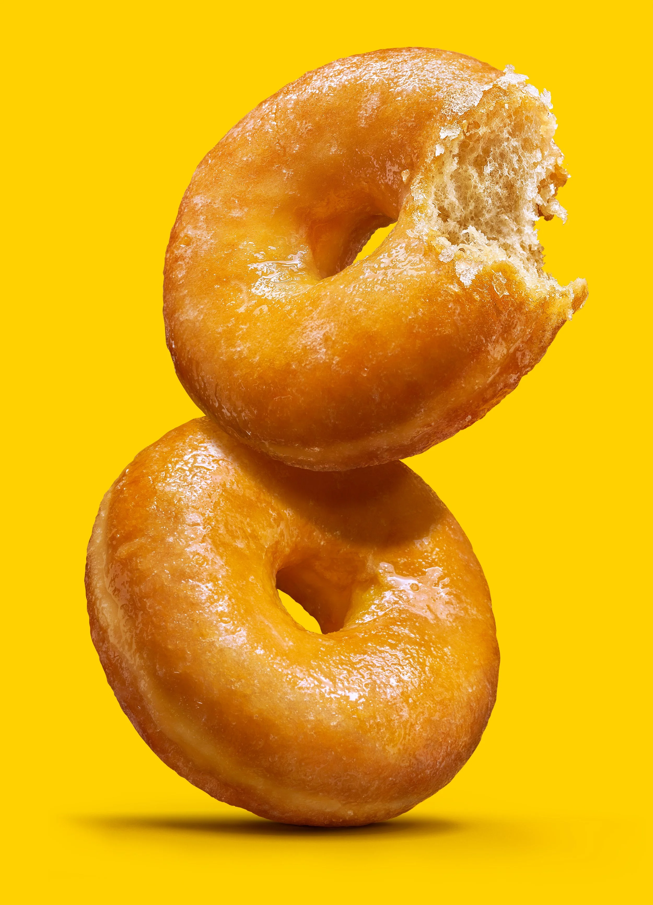
Donuts Glacé duo
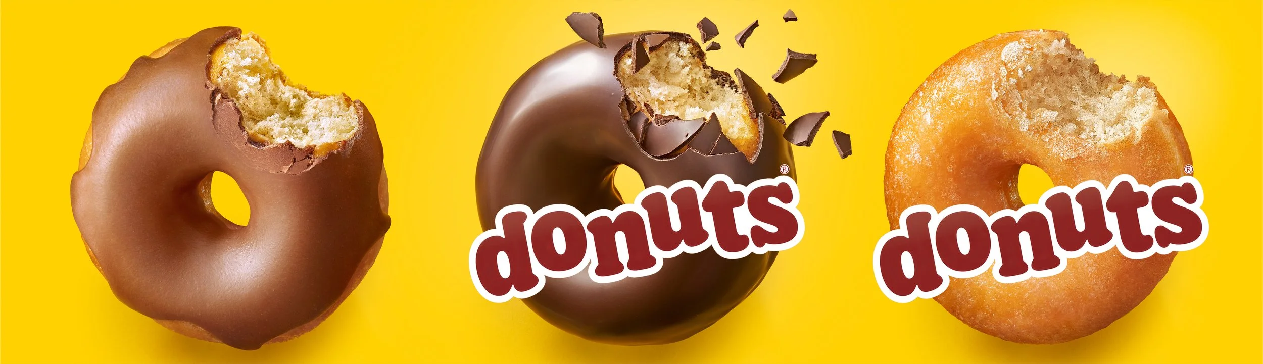
Pack images, one per variety, each composed around the wordmark
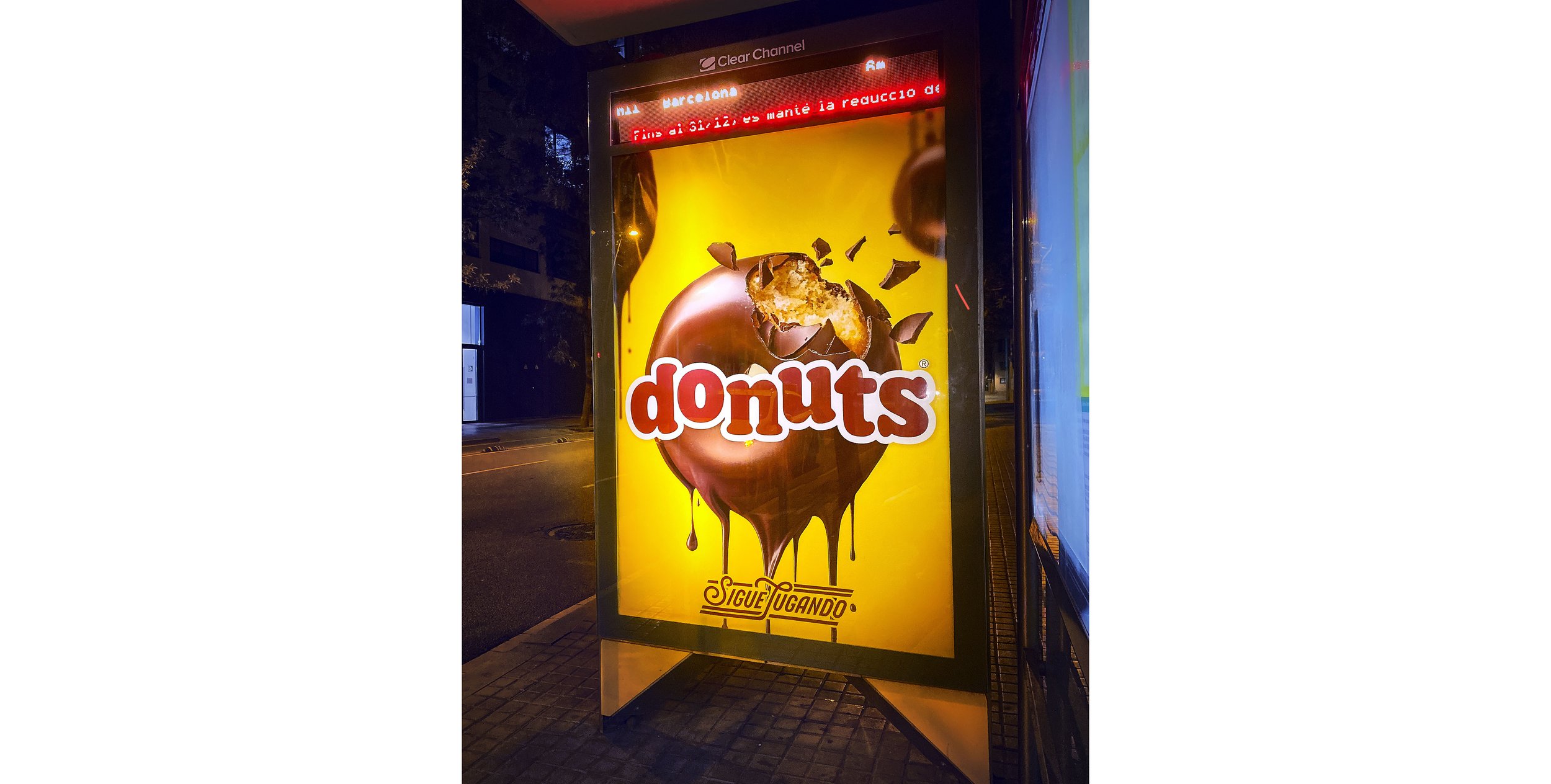
Donuts Bombón spotted on the way home…
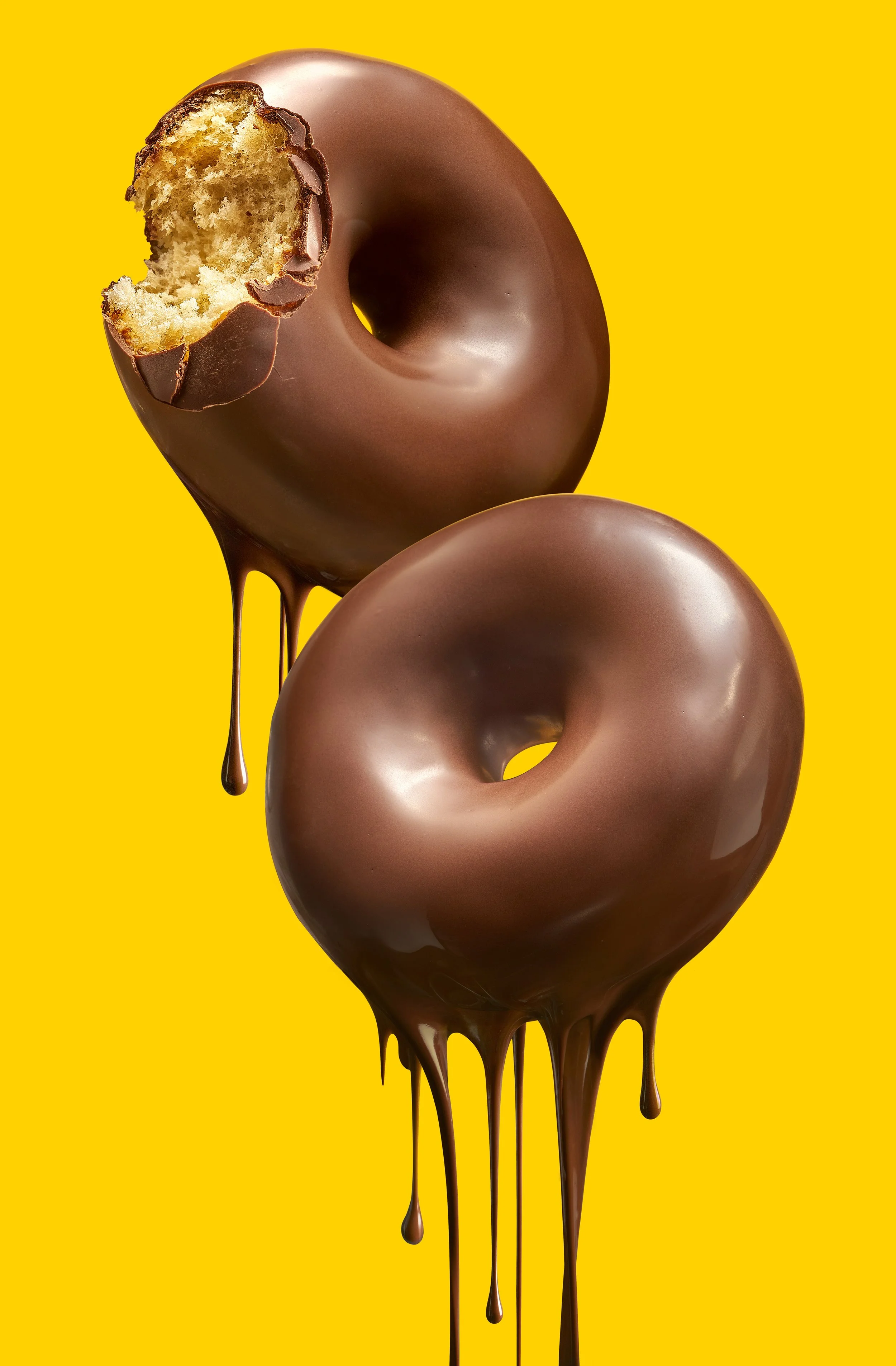
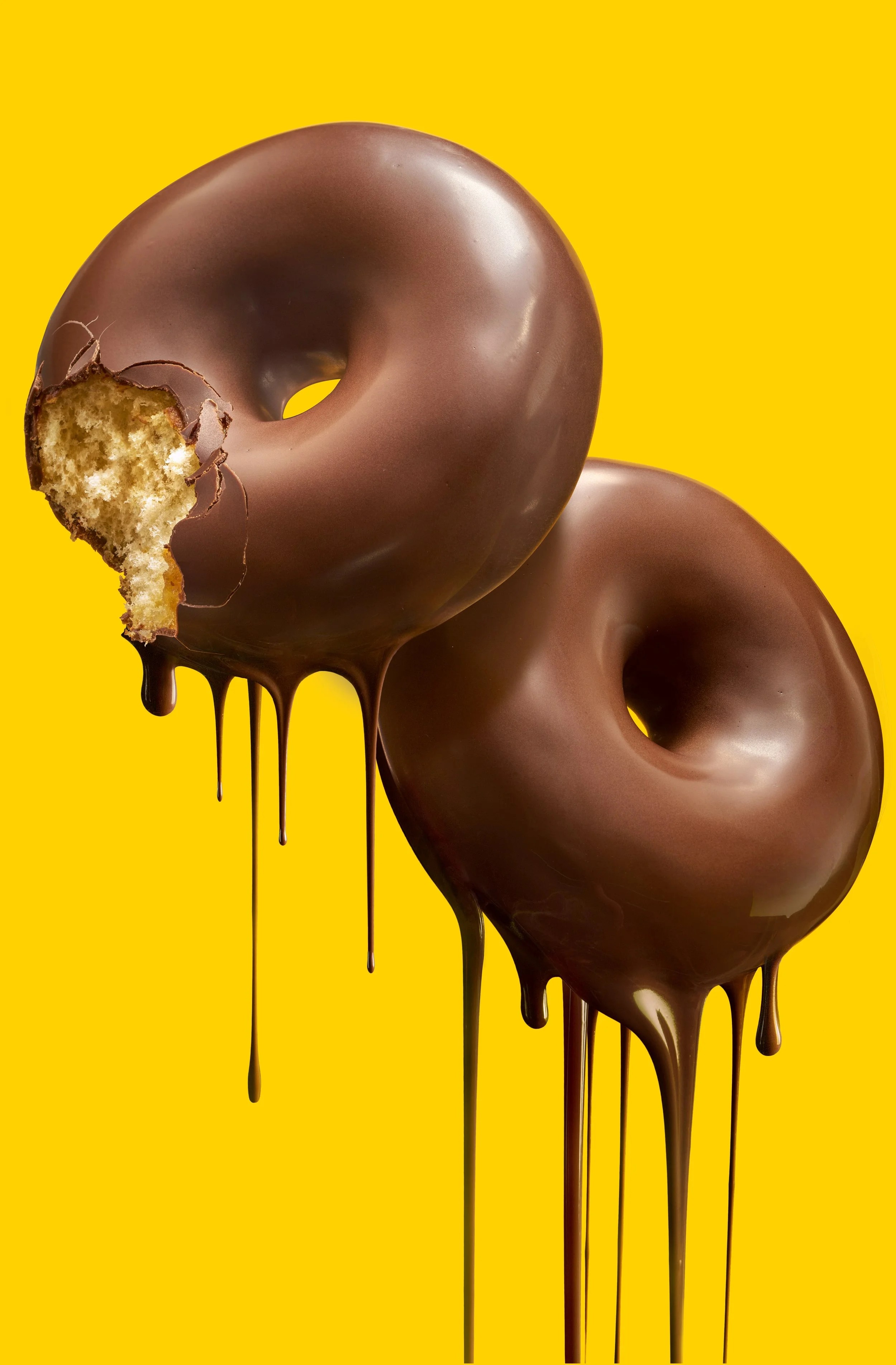
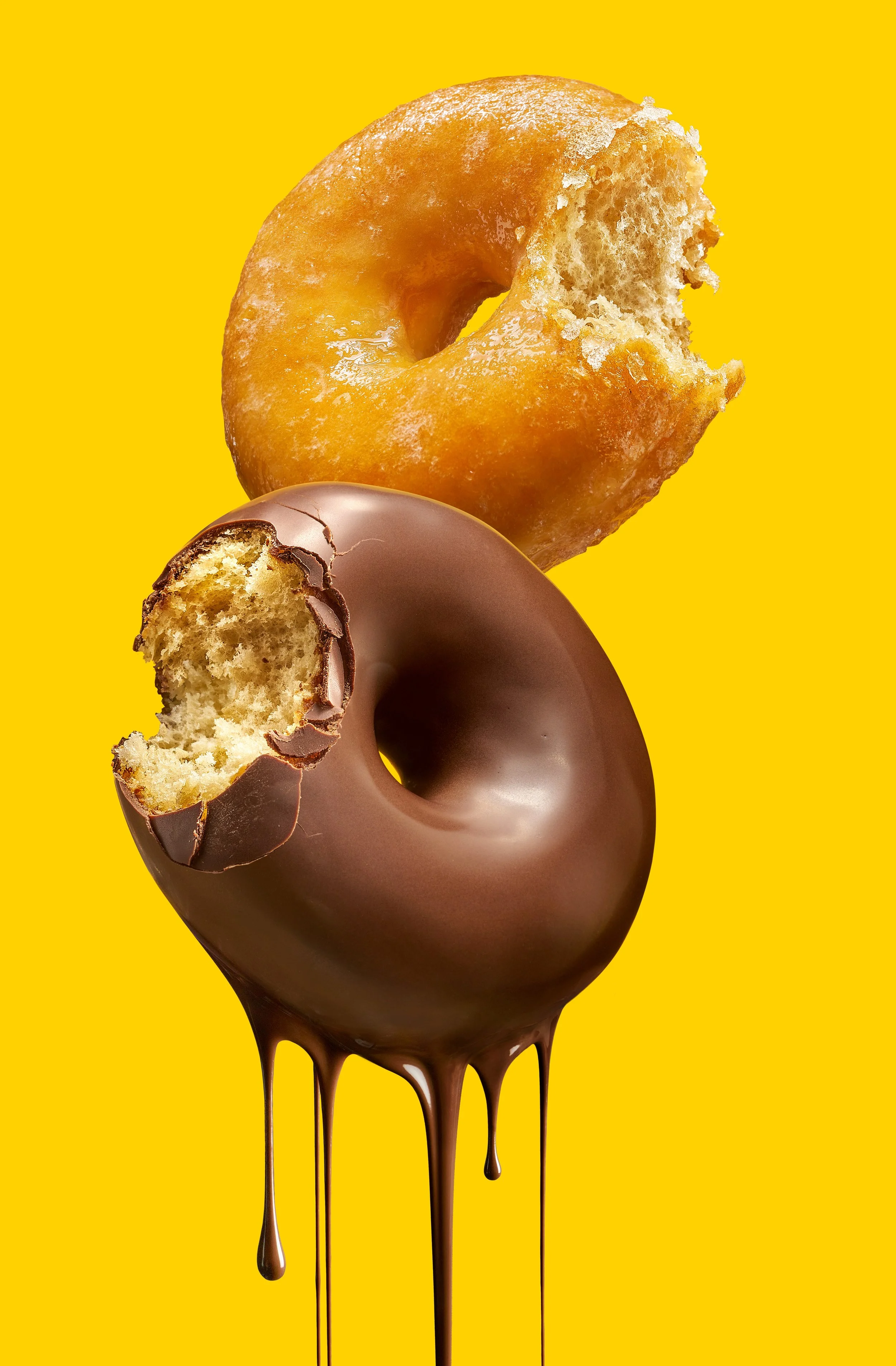
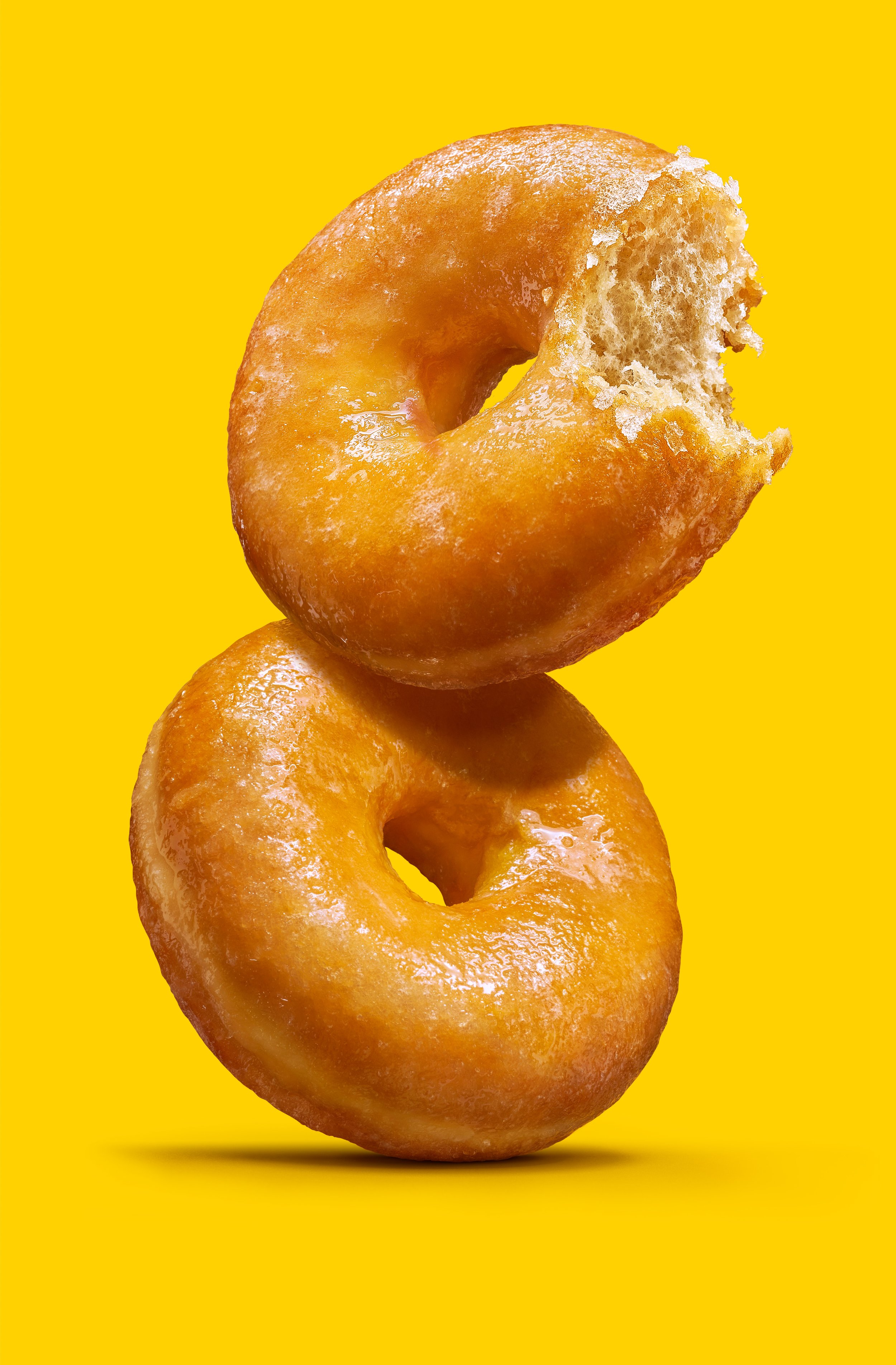
the four “duos”, as we called them on set
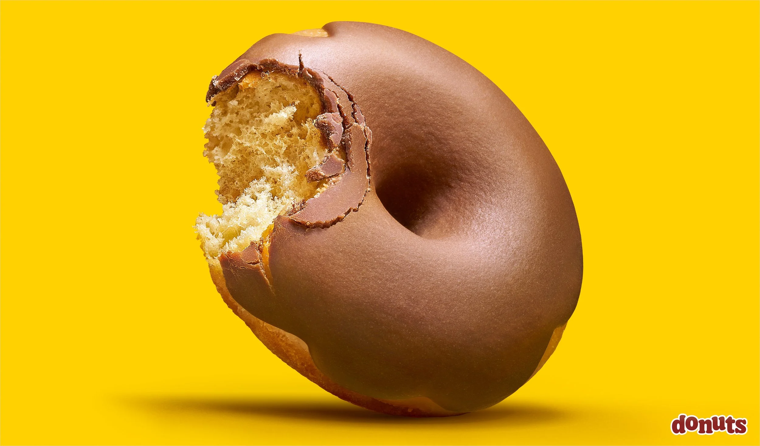
the Donuts Fondant