
• Recent Work
  • case studies New !!
  • Drinks & Splashes
  • Food & Packaging 01
  • Food & Packaging 02
  • about
  • contact
  • Menu

Paco Arará - Advertising, Food & Packaging Photography

  • Recent Work
  • case studies New !!
  • Drinks & Splashes
  • Food & Packaging 01
  • Food & Packaging 02
  • about
  • contact

Firehouse Subs — The Art of Subs 01

October 20, 2026

Client: Restaurant Brands International · Firehouse Subs Agency: Draft Punk

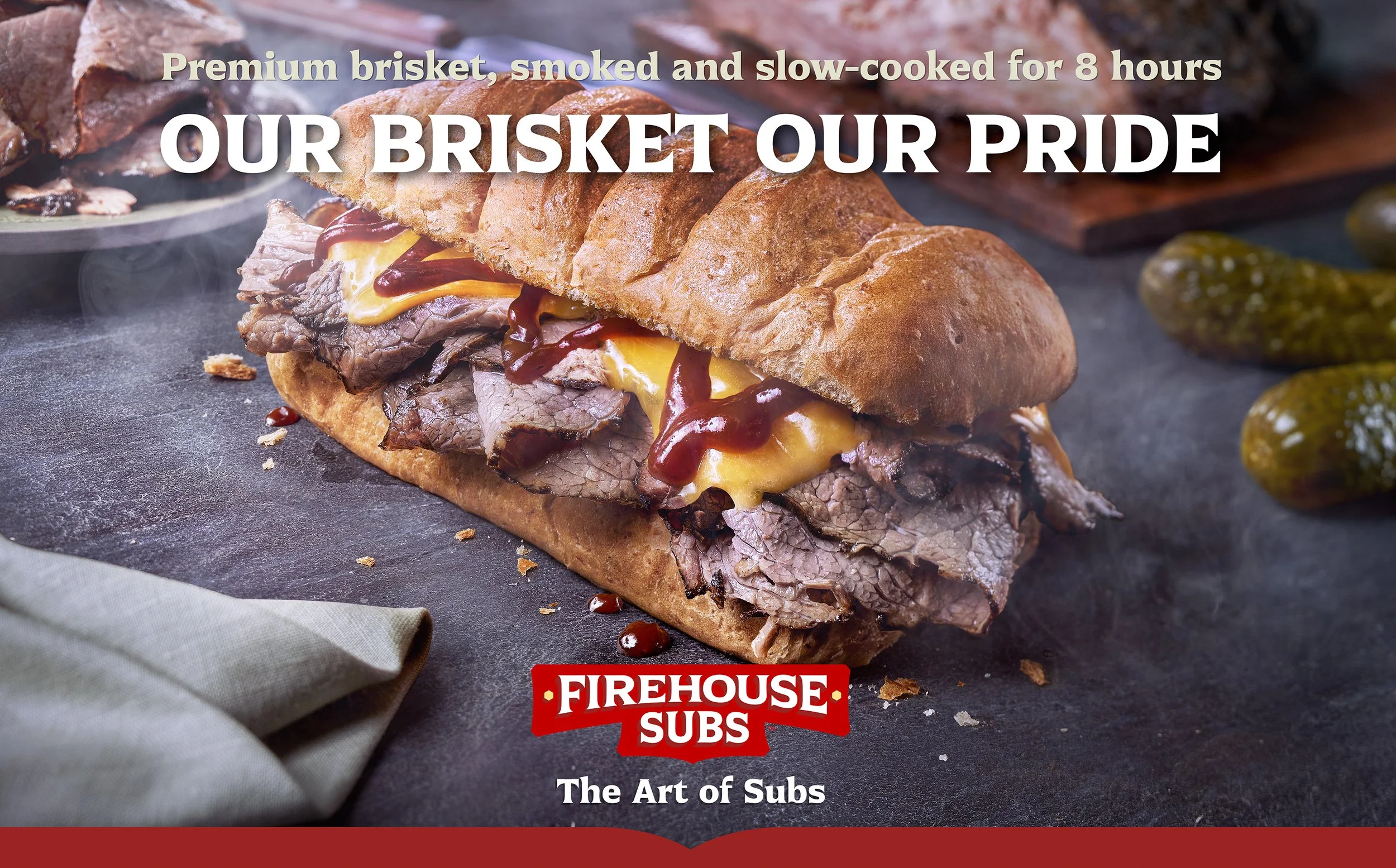
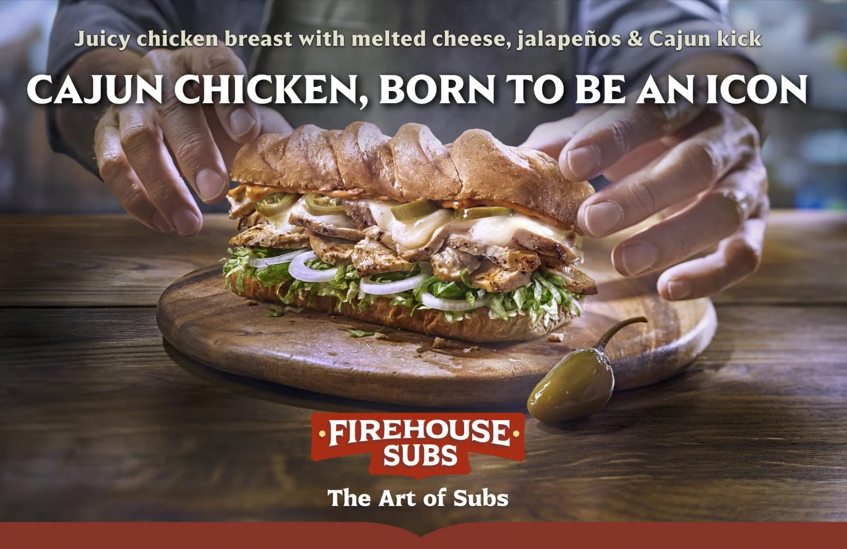
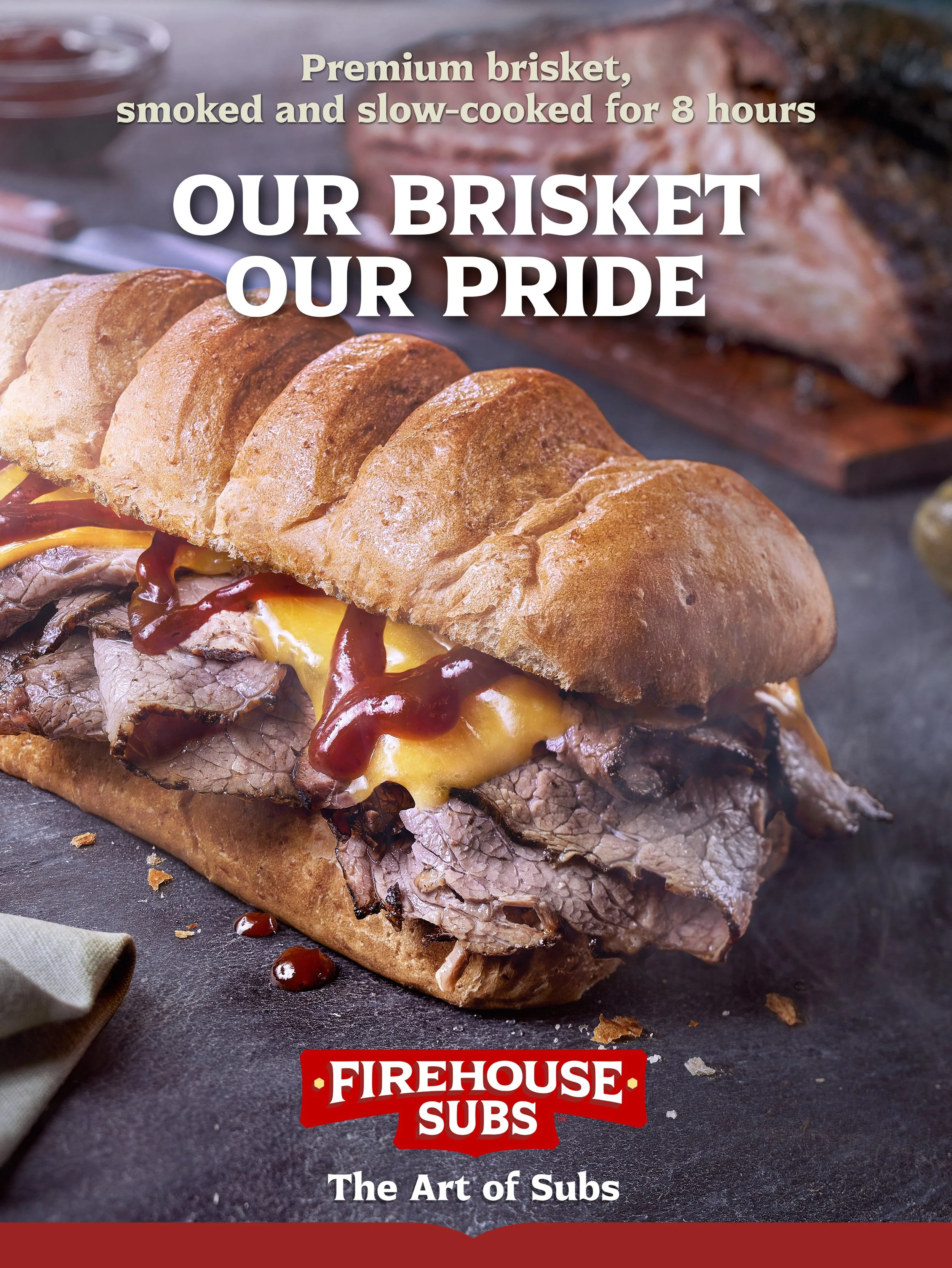
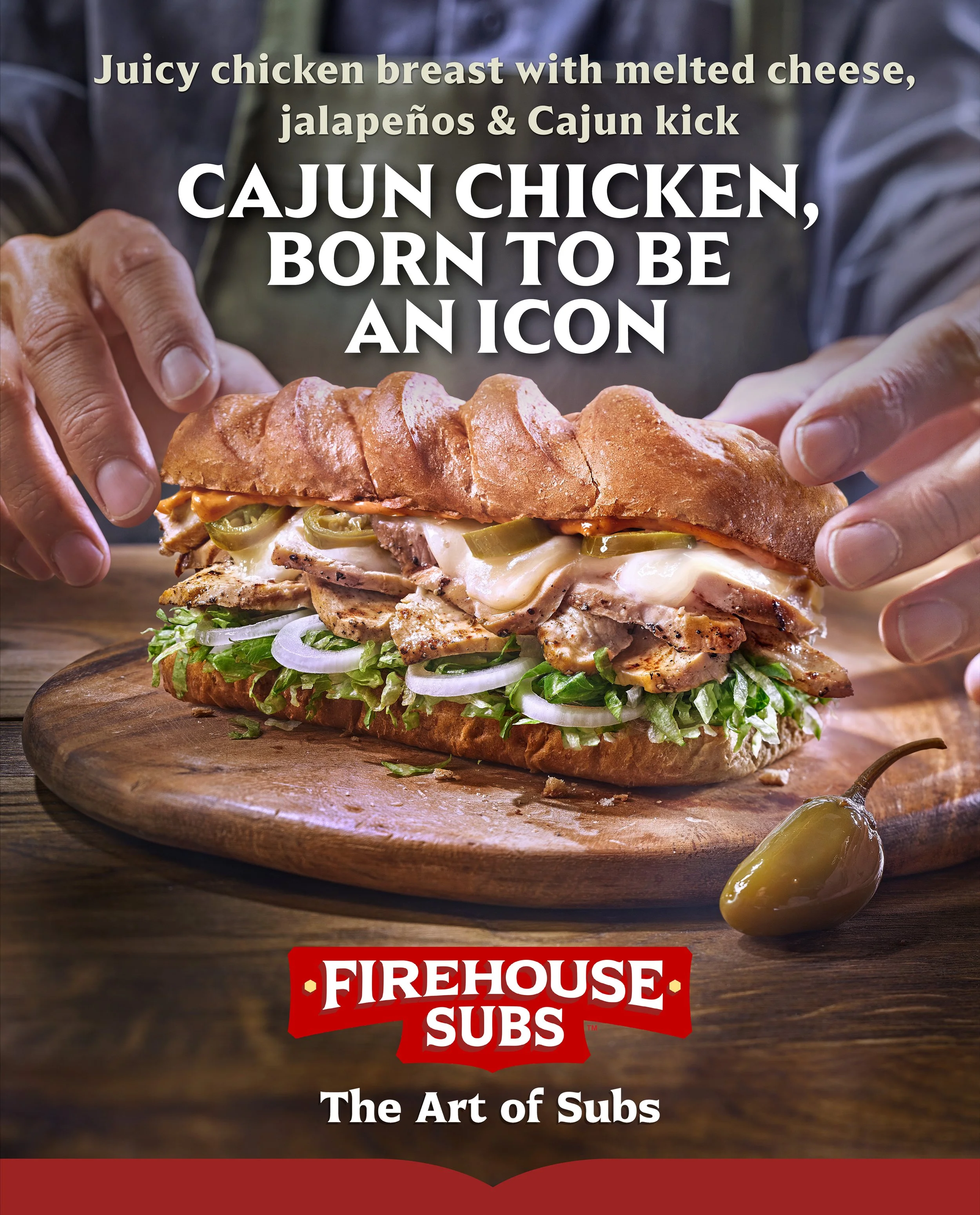
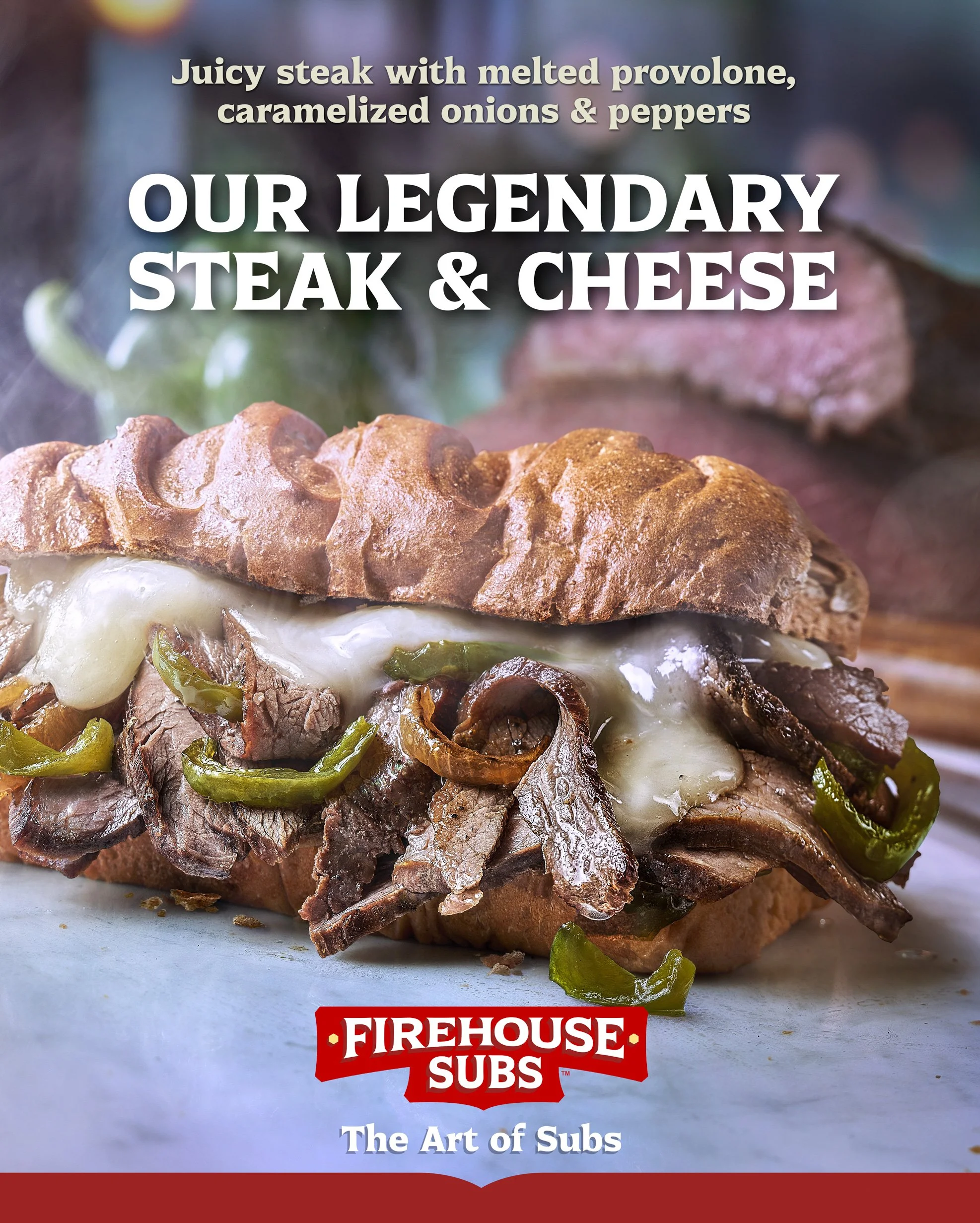
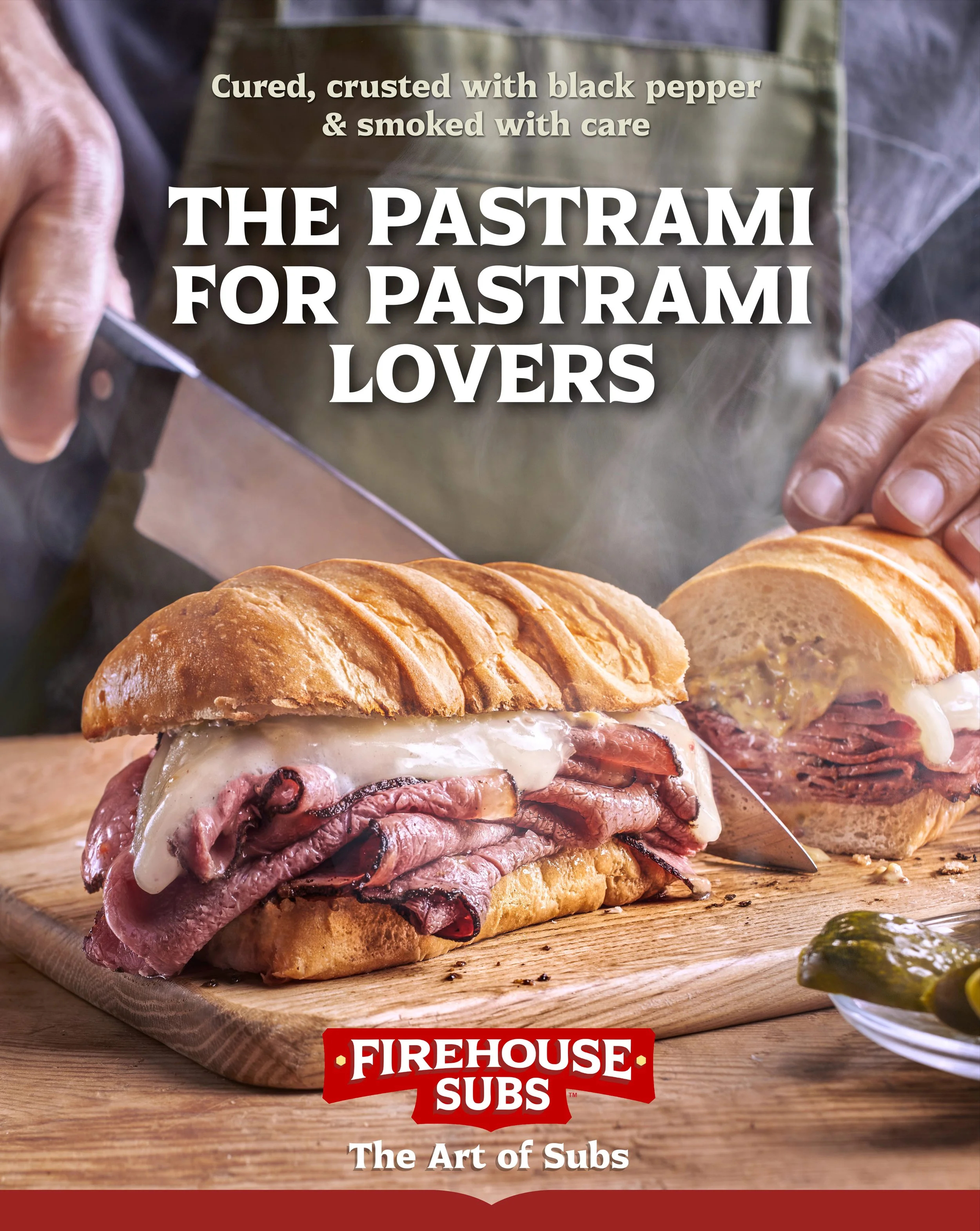
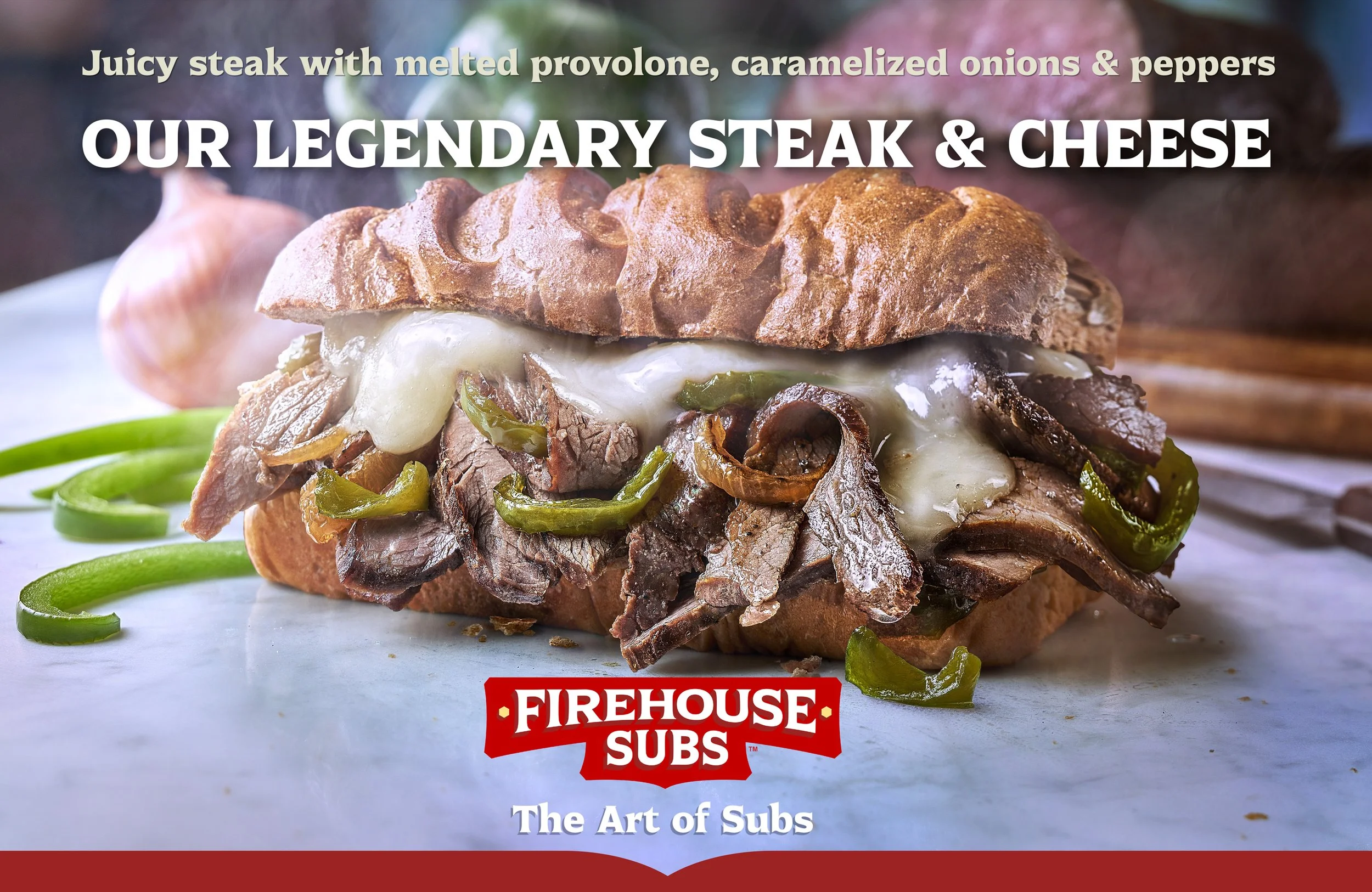
“The Art of Subs”, with that concept, the creative team at Draft Punk reimagined the identity of Firehouse Subs, the sandwich chain owned by RBI, the group behind Burger King. Our task was to translate the idea into four campaign images, each with its own atmosphere, all sharing one approach to the product and to the care behind it.

Meat warmed through the brand’s own process, melted cheese, toasted bread edges: the images had to carry the warmth and immediacy of a sub made to order. We built each one to FHS recipes, with the brand’s own ingredients. A preliminary session let us learn the process first-hand, and FHS’s global head chef oversaw every build on set. That fidelity secured, we worked with light, volume and texture to show each recipe at its best.

Every scene was composed and shot to yield both landscape and portrait visuals, with the graphic layout accounted for from the outset. In the two images featuring a chef, that balance took particular care: the sub at its peak had to coincide with a natural gesture and with precisely placed hands and arms. The chef’s body was both part of the composition and a surface for the graphics to sit on.

In our Barcelona studio we built four independent sets, each with its own lighting, camera and capture station, and photographed the scenes consecutively without striking any of them. Each image got the attention it needed, the shoot kept moving, and every set stayed available for later adjustments under identical light and perspective.

That paid off when the bread spec changed after the shoot. We photographed the new bread in exactly the original positions and brought it into the images, with the framing, perspective and lighting intact and no need to reshoot.

Once the project was complete, the client asked us to document the visual and technical approach in a photographic treatment guide. Now part of the brand’s new Brand Book, it is the reference for keeping the visual language of “The Art of Subs” consistent across products, markets and future productions.

We’re proud to have been part of it.
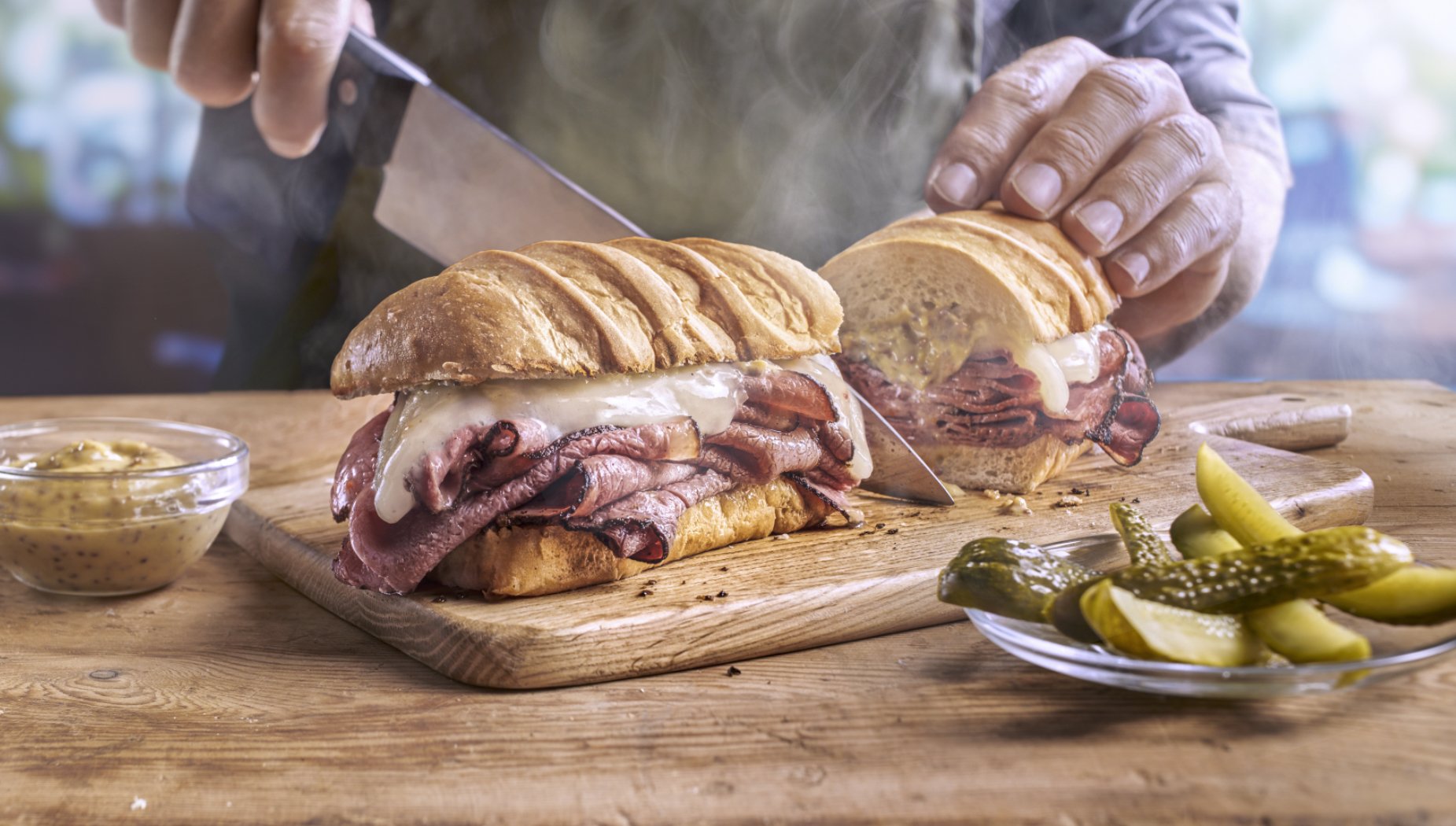
Chef at work on Pastrami
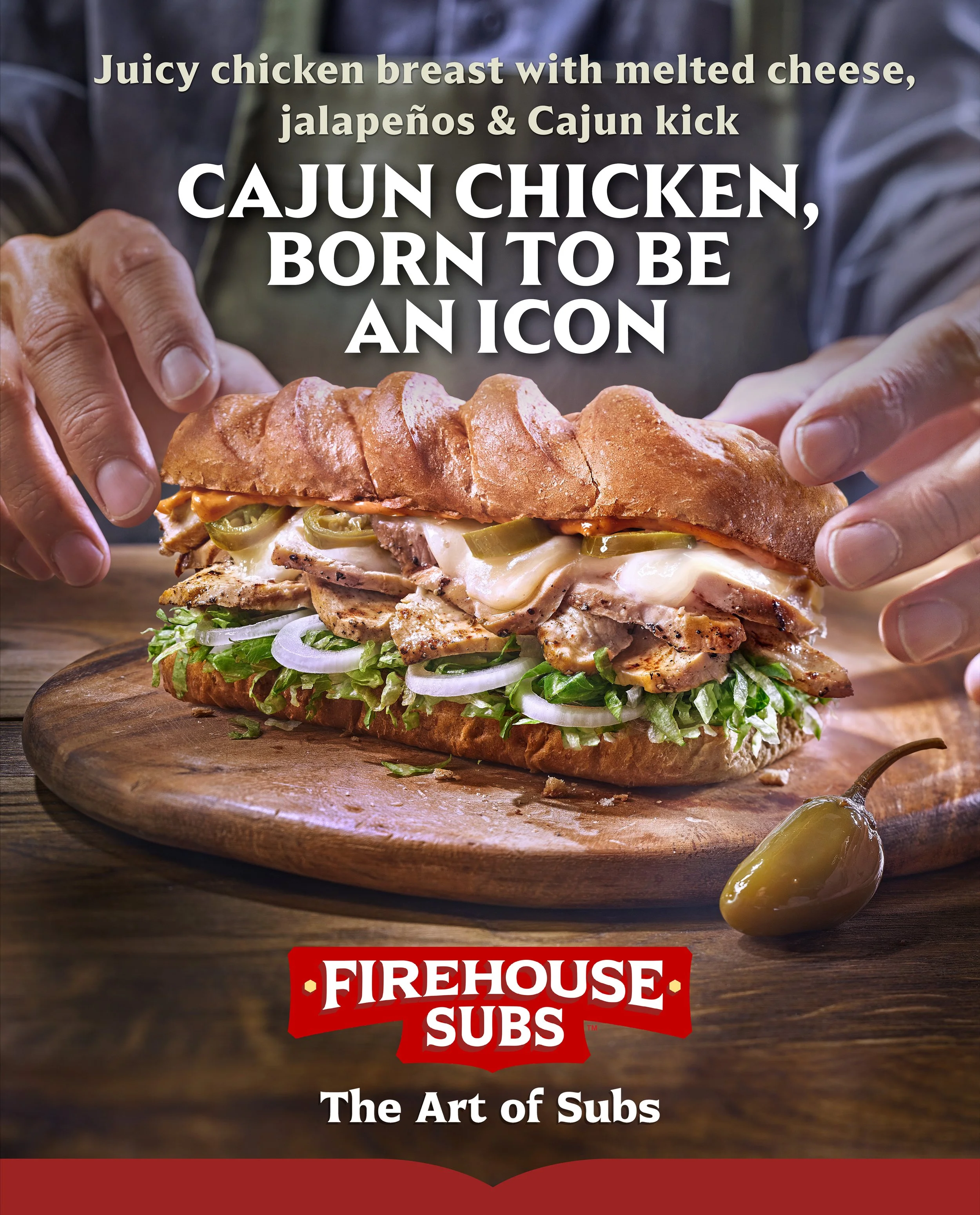
Chicken Cajun vertical key visual
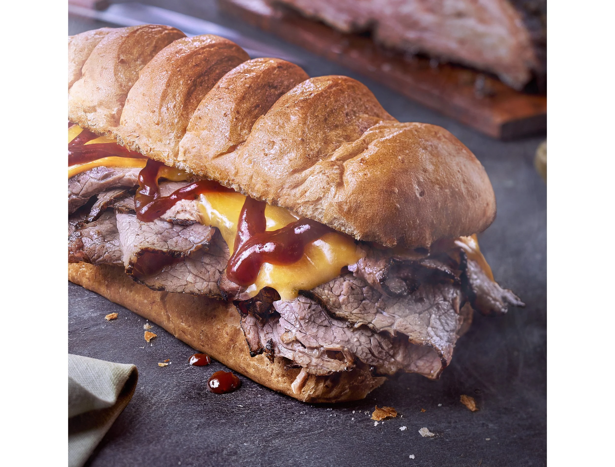
Brisket & Cheddar close-up
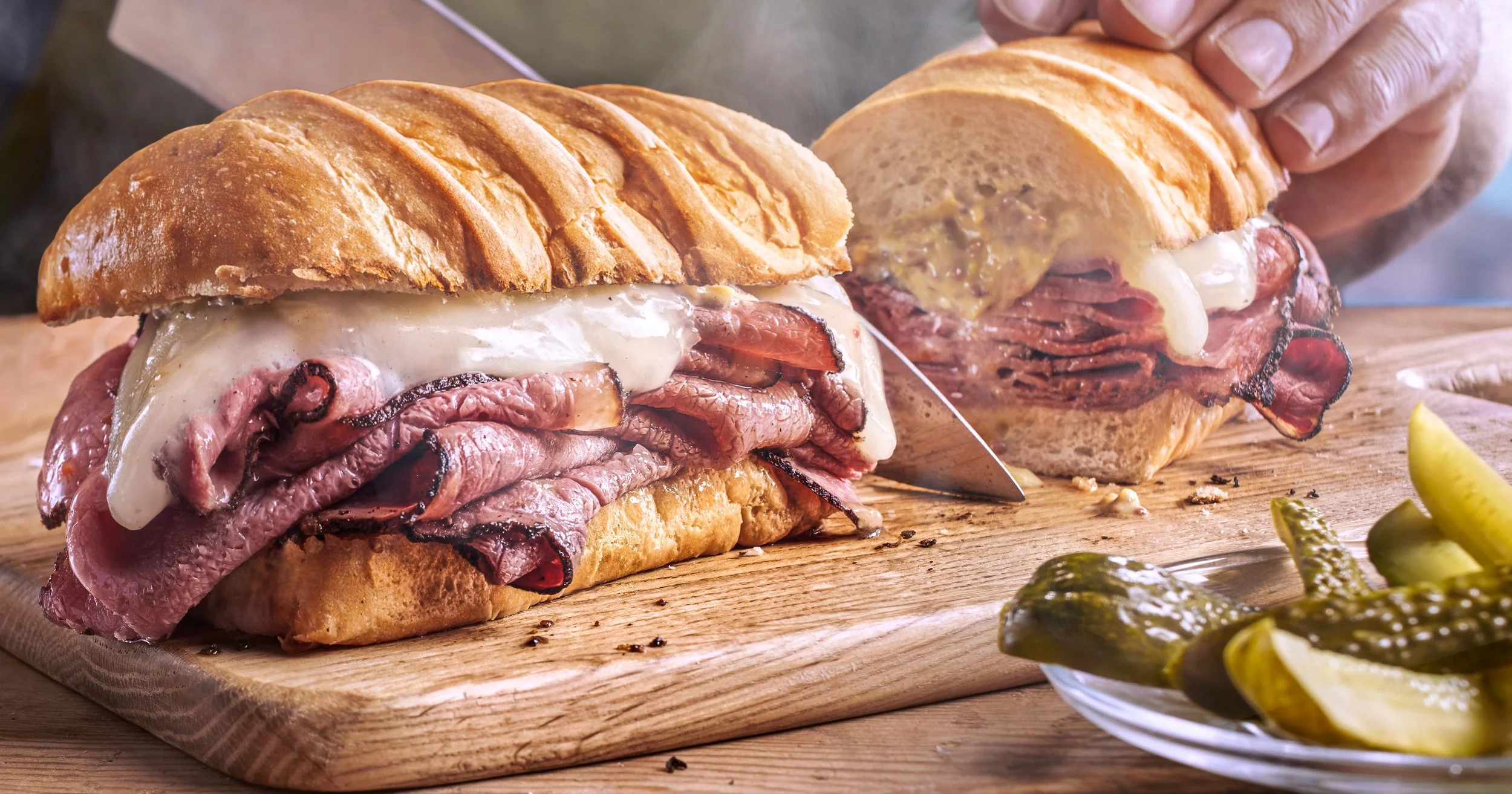
Pastrami close-up
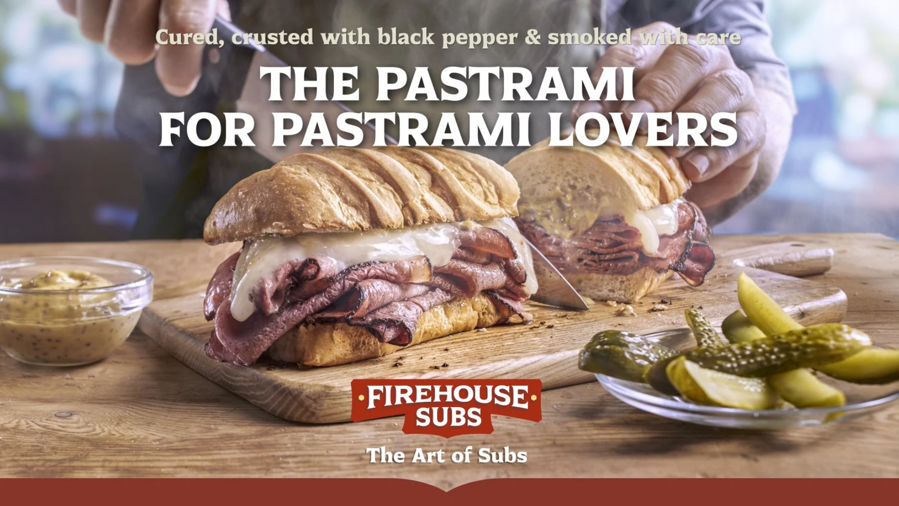
Pastrami horizontal key visual
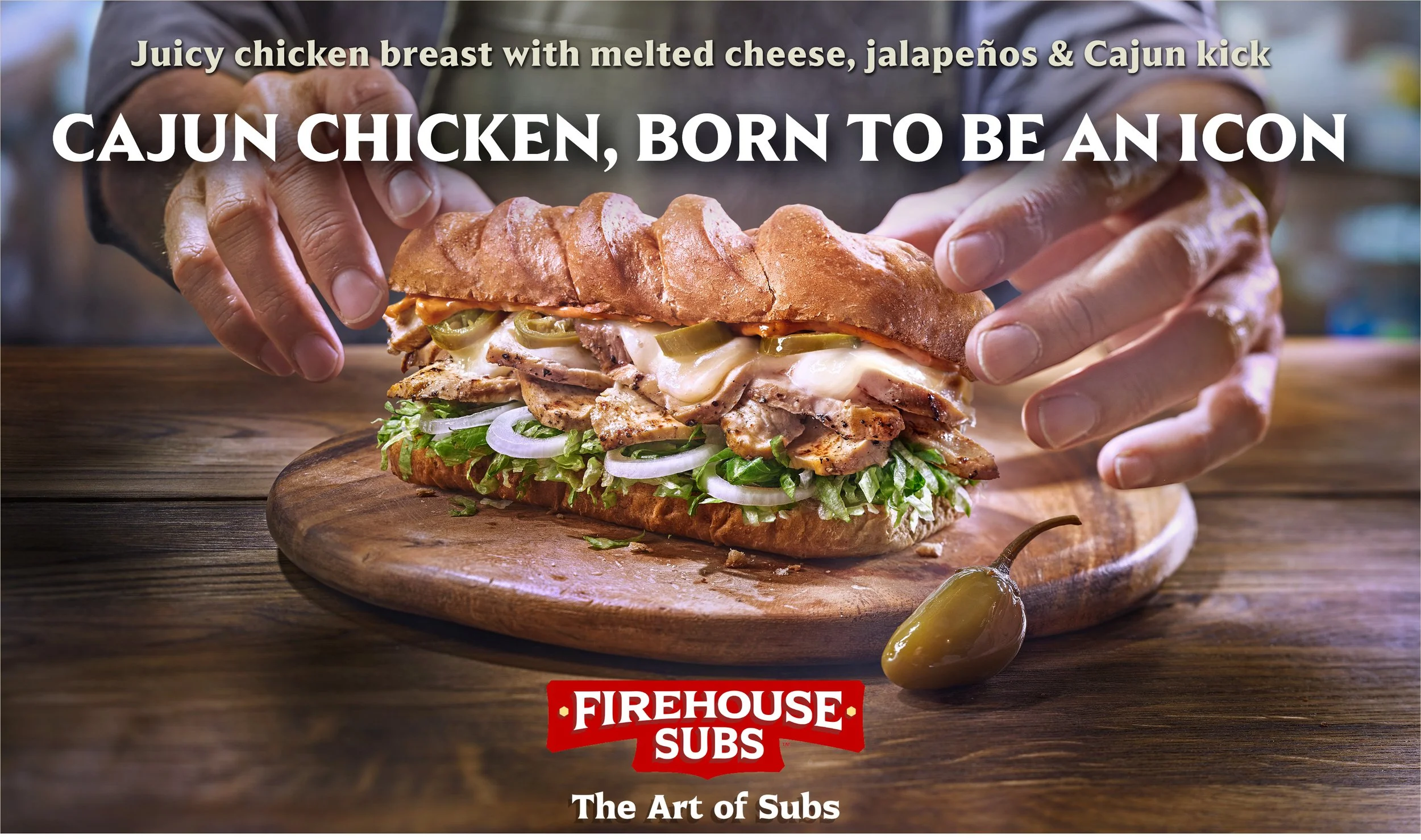
Chicken Cajun horizontal key visual
Screenshot 2026-10-08 at 14.32.47.jpg
1AA-Sandwich-FHS-Steak-&-Cheese-04-02-para-WEB-2026-Con-Grafica-HORIZONTAL-para-Case-Study.jpg
FHS-Subs-Brisket-&-Cheddar-KV-04-para-WEB-2026-01-HORIZONTAL-con-Grafica.jpg
Screenshot 2026-10-08 at 12.58.06.jpg
FHS-Subs-Brisket-Cheddar-Crop-Con-Grafica-VERTICAL-Para-WEB-2026-Case-Study-01.jpg
FHS-Subs-Chicken-Cajun-KV-03+Canvas-VERTICAL-Para-WEB-2026-01.jpg
1AA-Sandwich-FHS-Steak-&-Cheese-04-02-para-WEB-2026-Con-Grafica-VERTICAL-para-Case-Study.jpg
FHS-Subs-Pastrami-KV-04-para-WEB-2026-02-VERTICAL-CON-GRAFICA.jpg

Campaign key visuals, horizontal and vertical executions
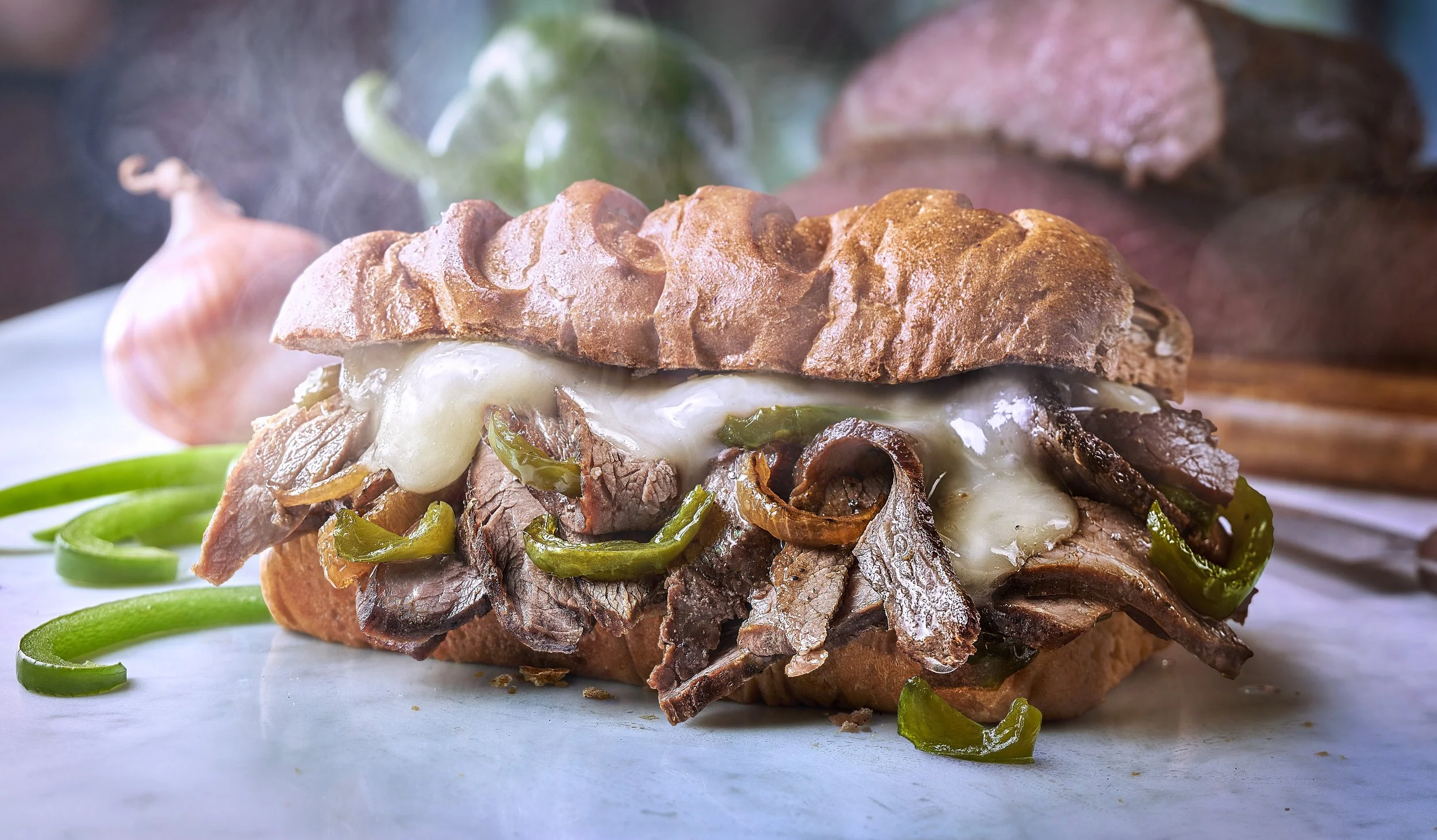
 

and this is the Steak & Cheese FHS Sub

all case studies

Bimbo Donuts 01

October 18, 2026

Client: Grupo Bimbo · Donuts® Design: In-house design department

The commission came from the in-house design department at Grupo Bimbo, the world’s largest baking company, and it began with the client’s own assessment: the images Donuts had been using were not doing enough to convey the freshness and naturalness the brand wanted to project.

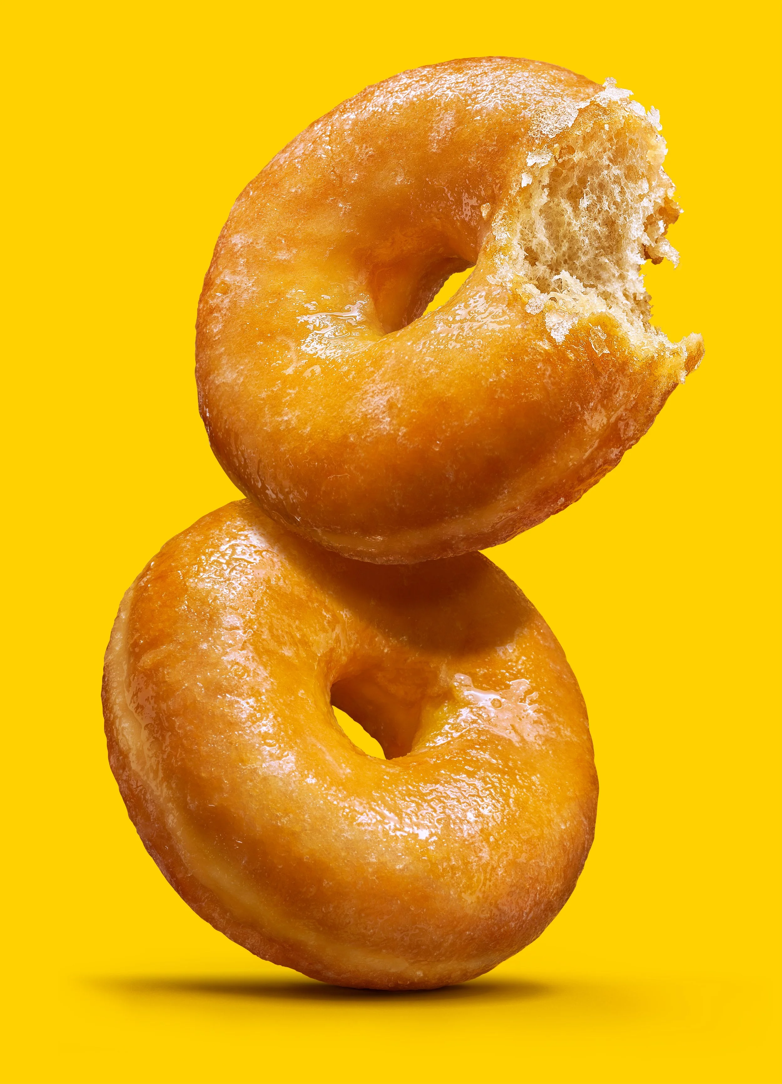
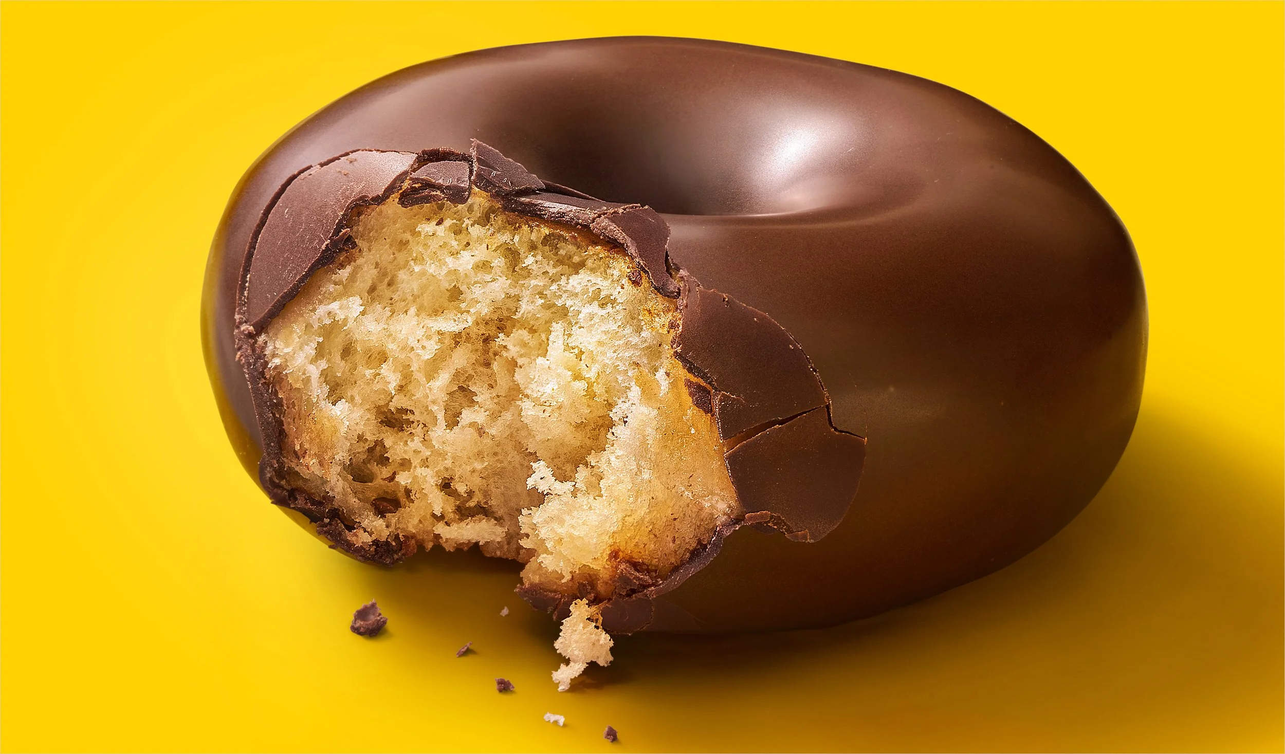
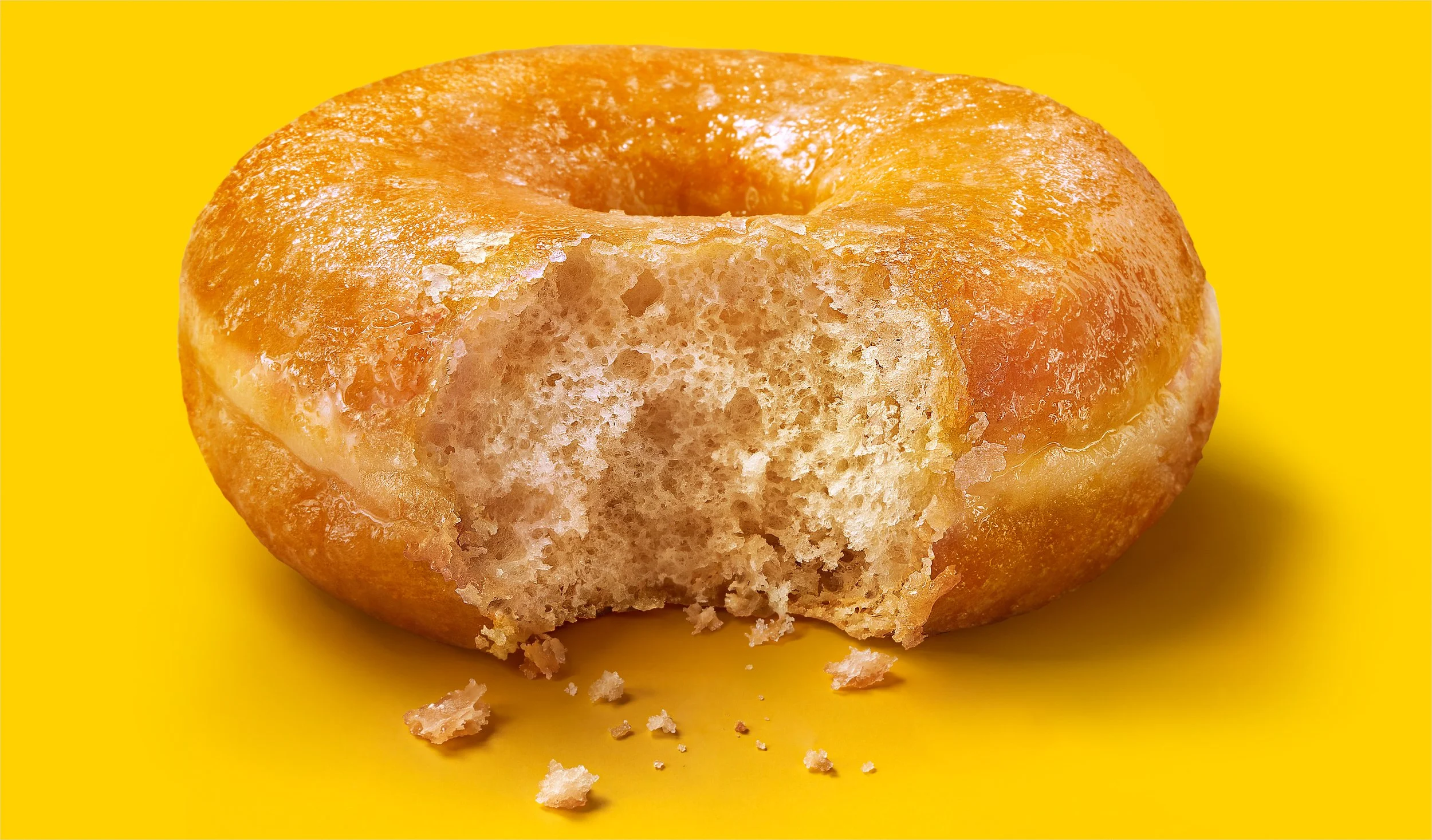
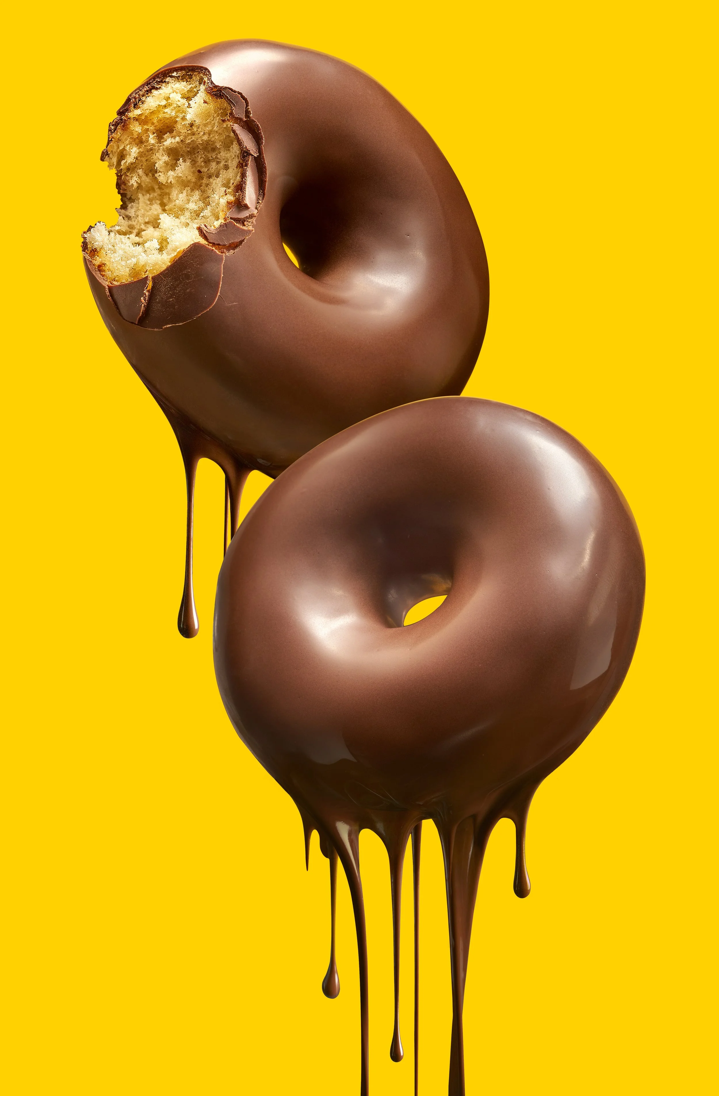
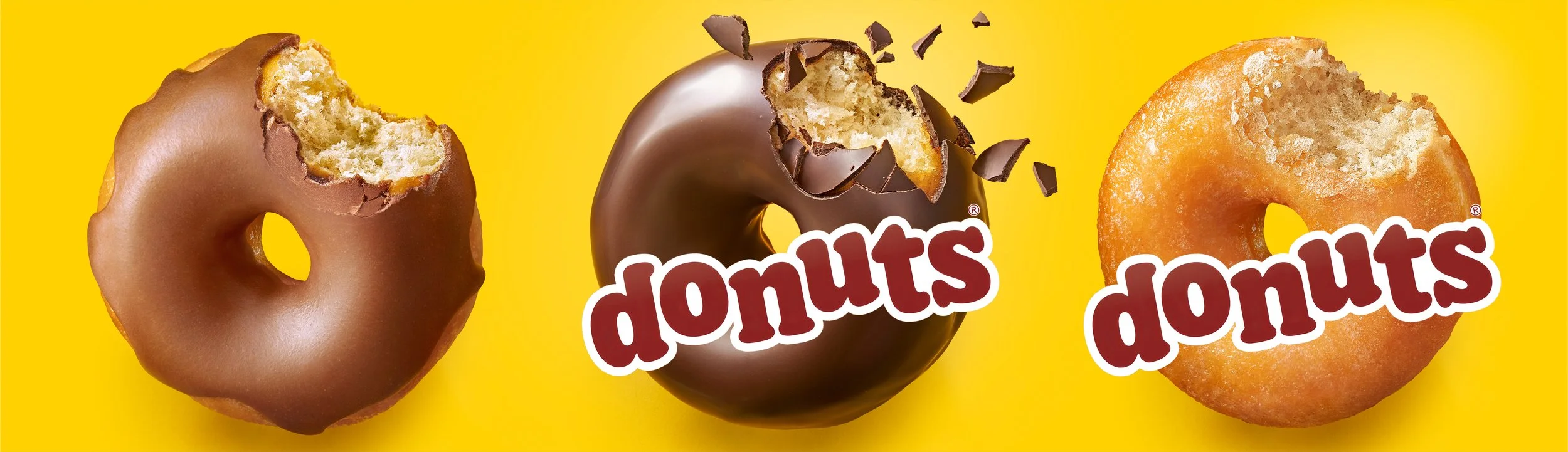
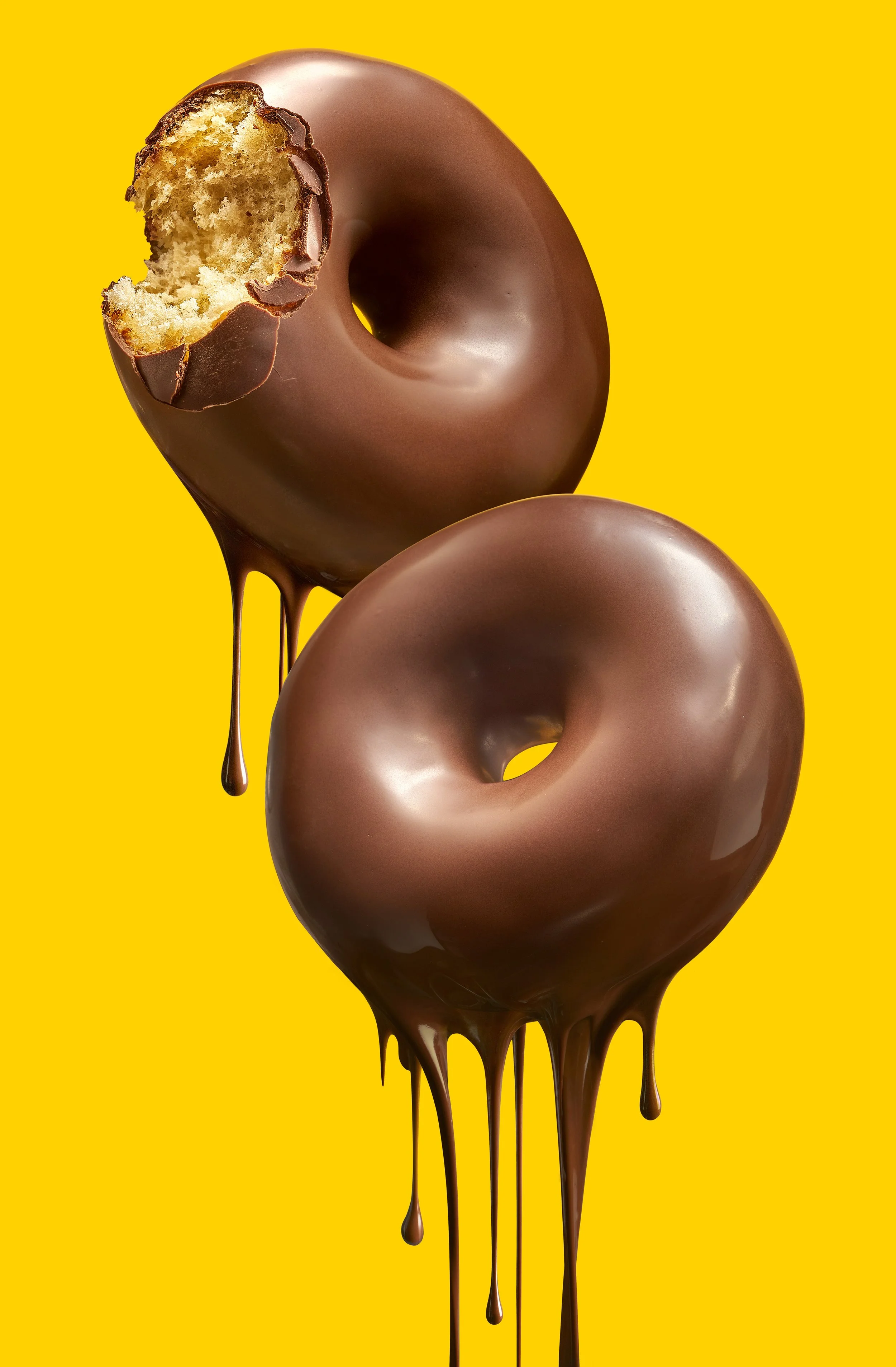
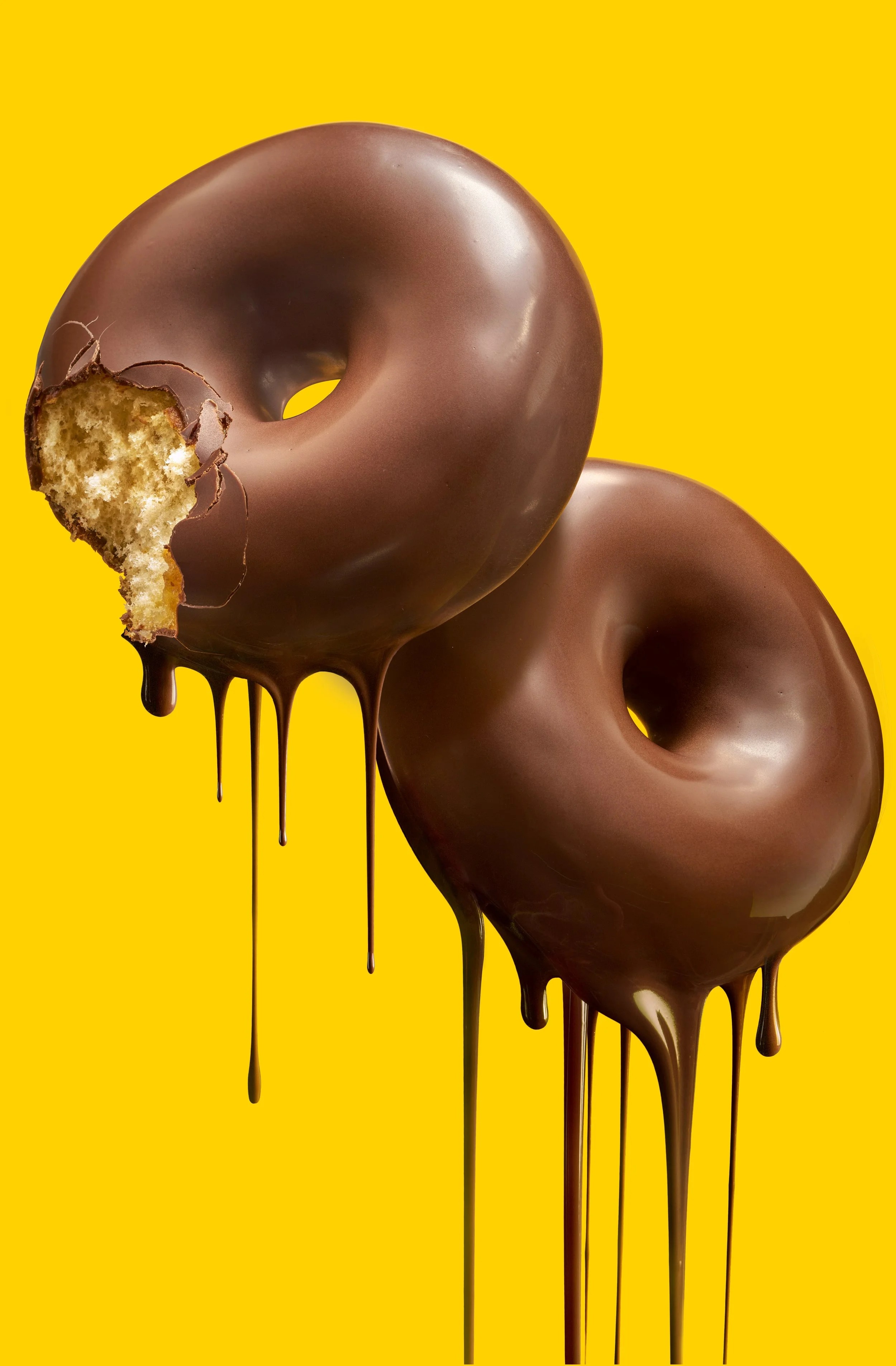
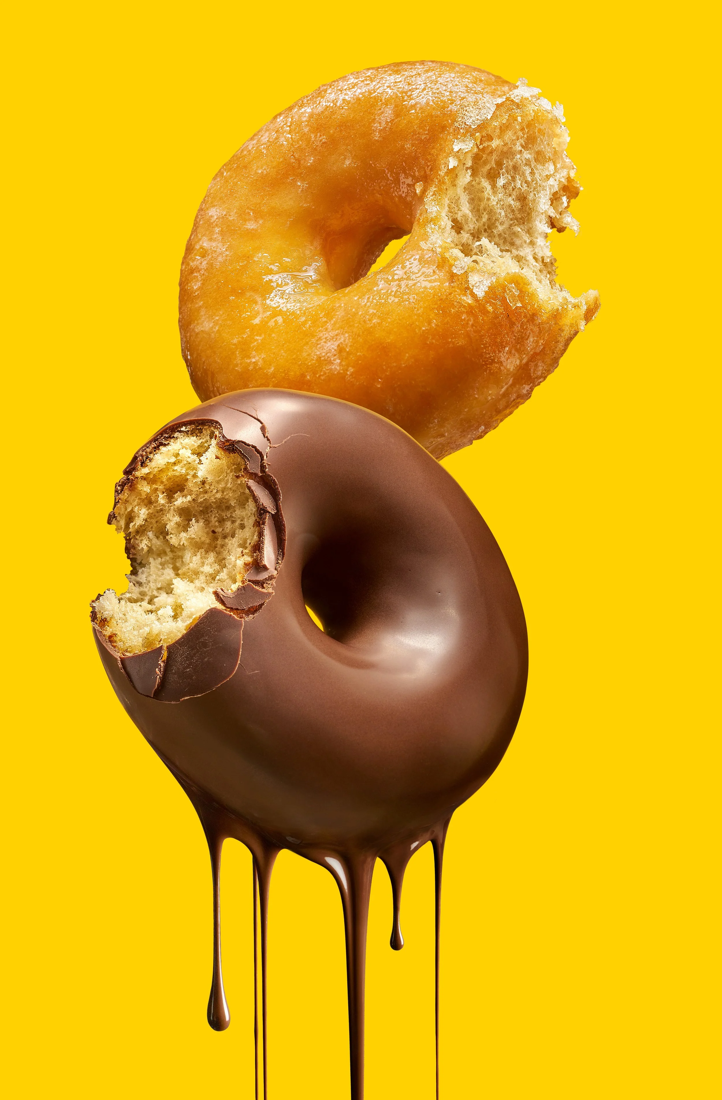
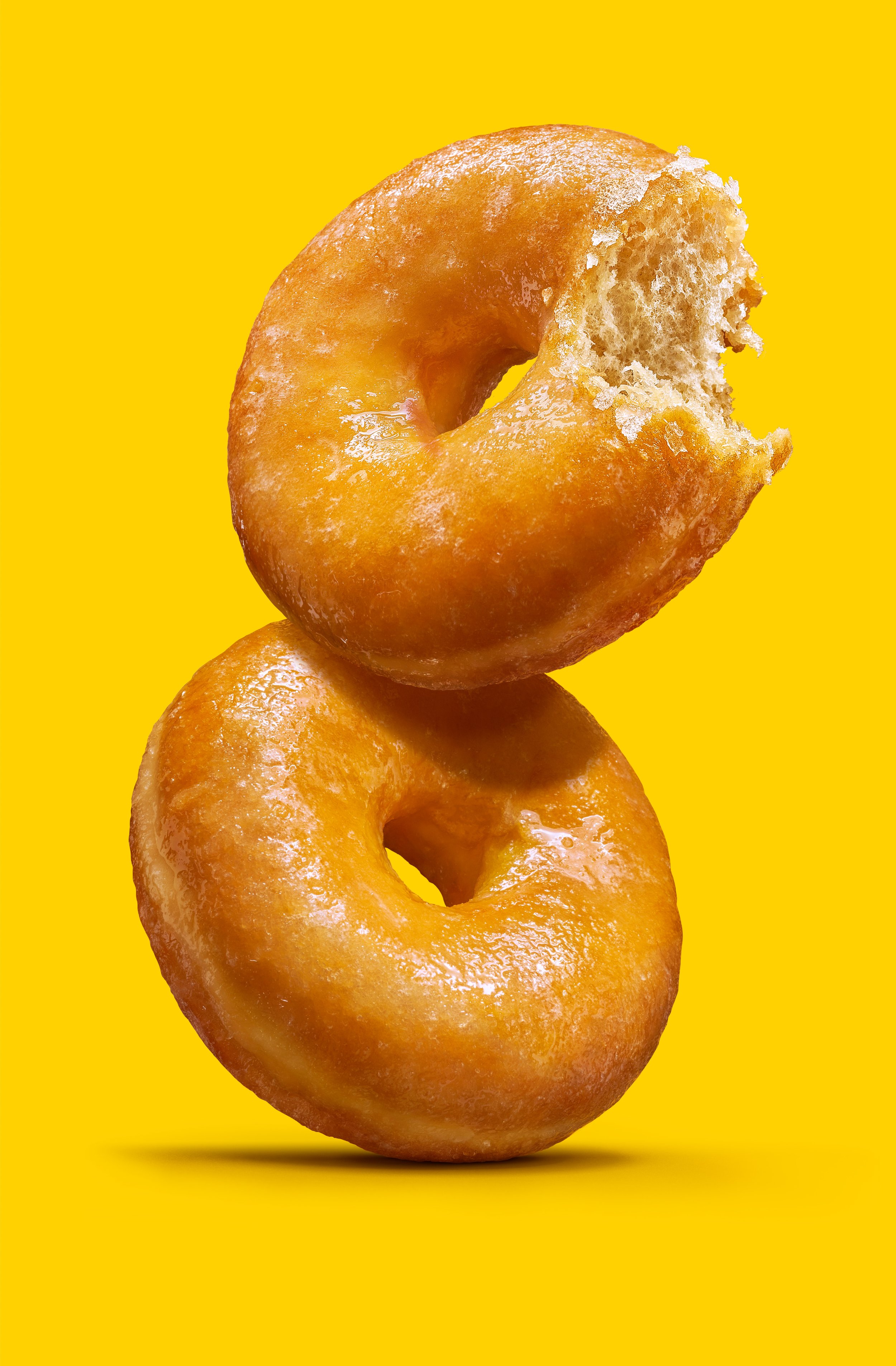
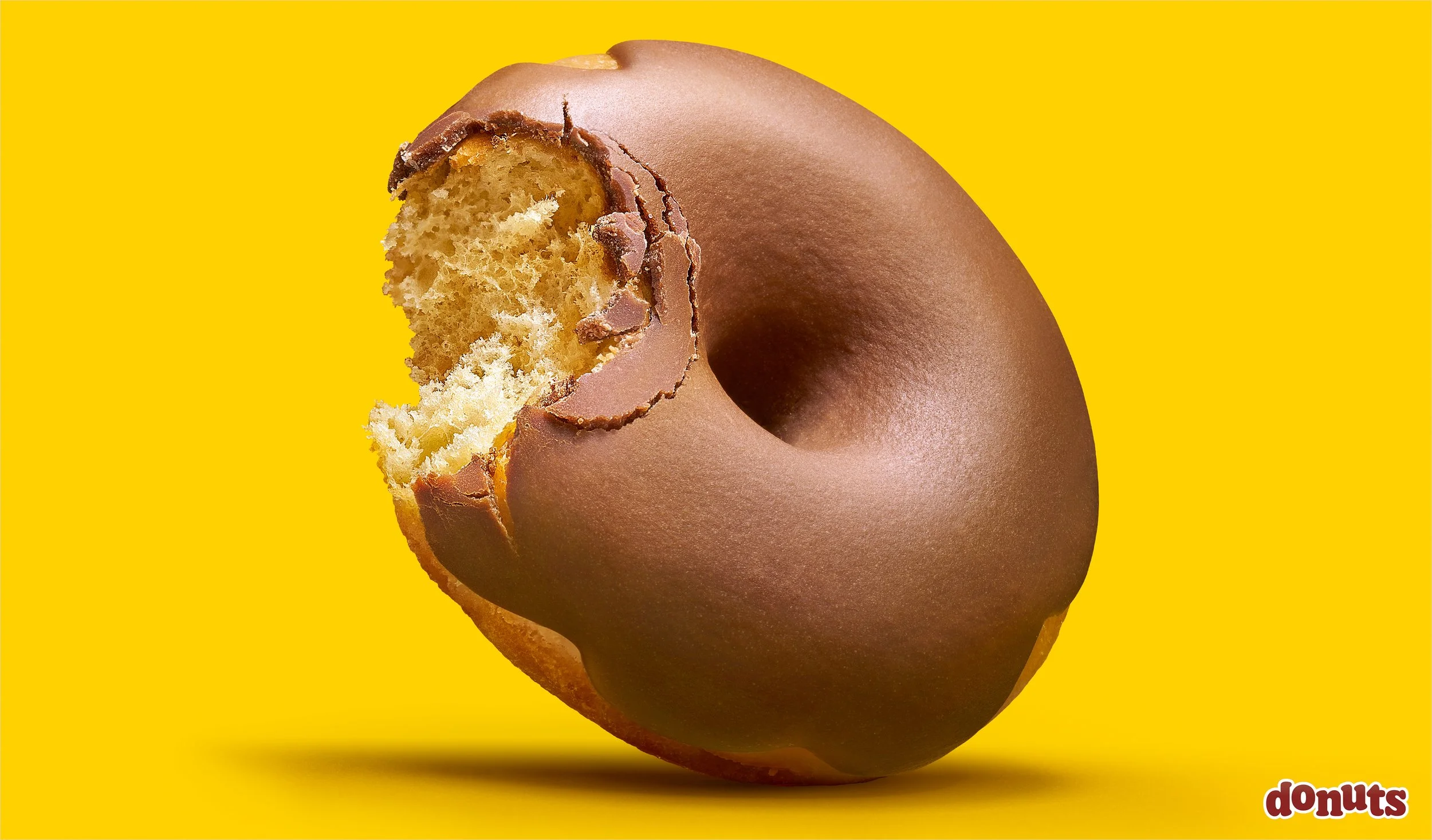
The brief came with one rule: the bite. And it was not a styling device, it was how we proved three different things with a single gesture: the softness of the crumb, the break in the sugar glaze on the Glacé, and the fracture of the Chocolate and Fondant coatings. A different proof in each variety.

We began with the packs. Rebuilding the packaging images first meant solving the photography against the constraints of the pack from the very first frame: the product had to sit inside a graphic composition that already existed, with its wordmark, its corporate yellow and its allotted spaces, and hold up to the reproduction demands of print.

With that language settled on the pack, we were commissioned to shoot a second series: the donuts photographed from different angles and in different positions, built to carry the new concept and the new product image across the rest of the brand’s communication.

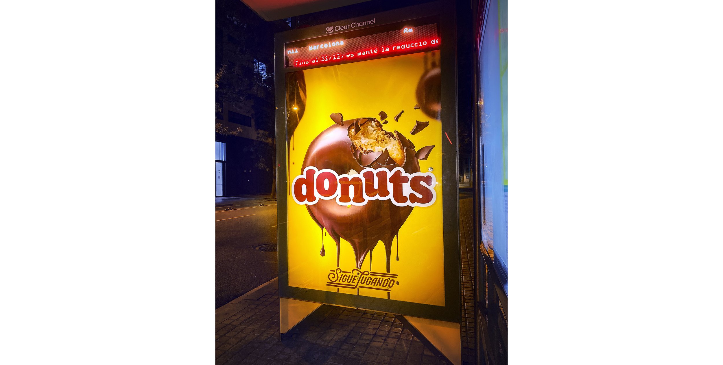
The images are used today across every one of the brand’s channels, from the pack you pick up off the shelf to the bus shelters on the street.

A body of work that keeps growing.

Donuts Glacé duo

Donuts Bombón

Donuts Glacé

Donuts Bombón duo

Pack images, one per variety, each composed around the wordmark

Donuts Bombón spotted on the way home…

Donut-Bombon-Visual-A-Duo-21b-RGB-para-WEB-01-240dp1-01.jpg
Donut-Bombon-Visual-A-Duo-03-RGB-Para-WEB-01-01.jpg
Donut-DUO-Bombon-+-Glace-03b-RGB-Para-WEB-01-01.jpg
Donut-Glace-Visual-A-Duo-02b-RGB-PARA-WEB-01.jpg

the four “duos”, as we called them on set

the Donuts Fondant

all case studies

Bimbo Bollycao

October 17, 2026

Client: Grupo Bimbo · Bollycao® Packaging design: Supperstudio Campaign creative: Ogilvy (La Combi Perfecta, with Nocilla). Está Pasando (Bollycao no se comparte)

Few products in Spain carry the affection a Bollycao does. It has been the after-school snack since 1975, and the pack says so itself. It sits in the collective memory of a country, and children learn the word before they learn to read.

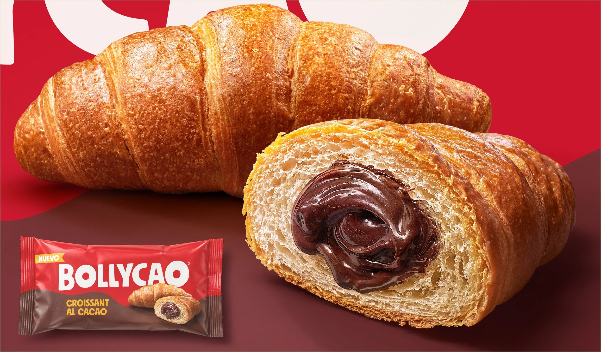
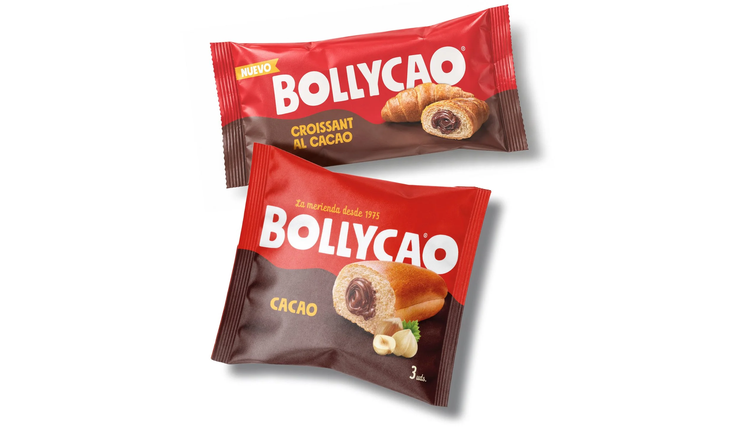
The commission from Bimbo Donuts Iberia was a set of product images originally intended for the packs, which later came to serve everything else as well: outdoor advertising, brand communication and social media. One set, not four. The same approach then carried across the range, from the Original to the Croissant al Cacao.

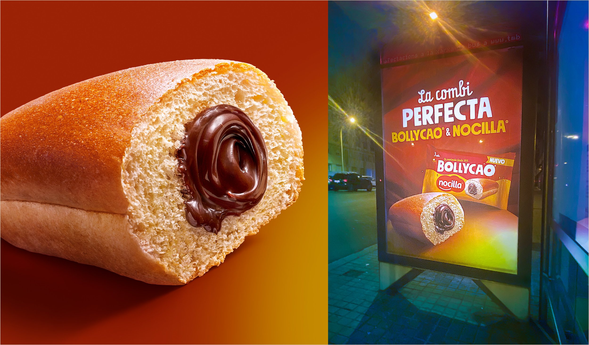
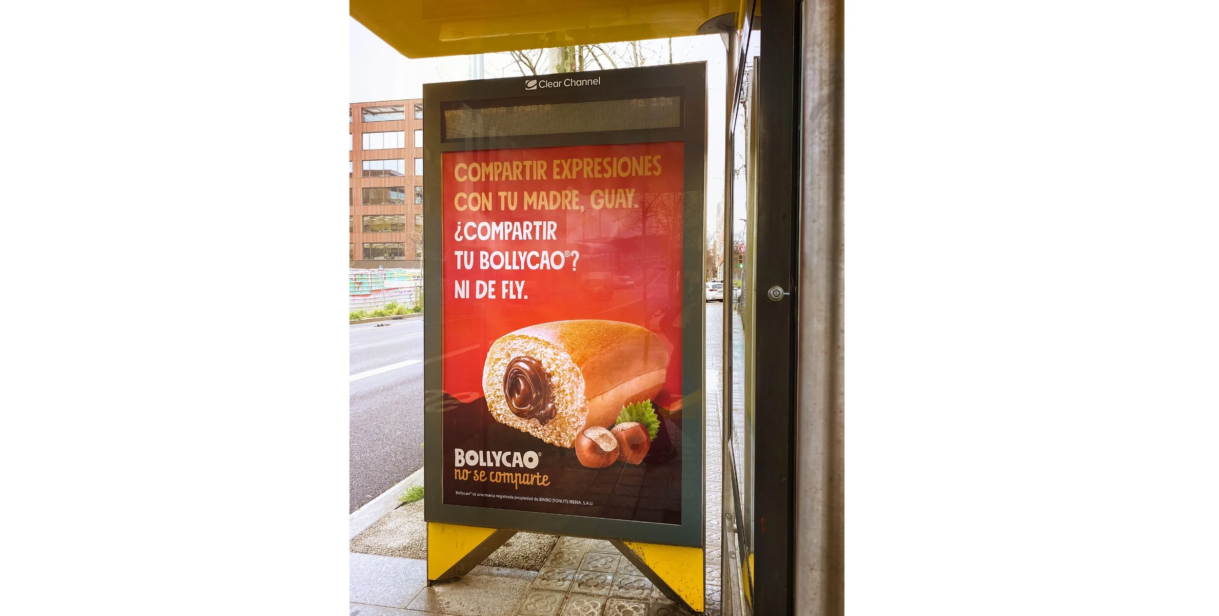
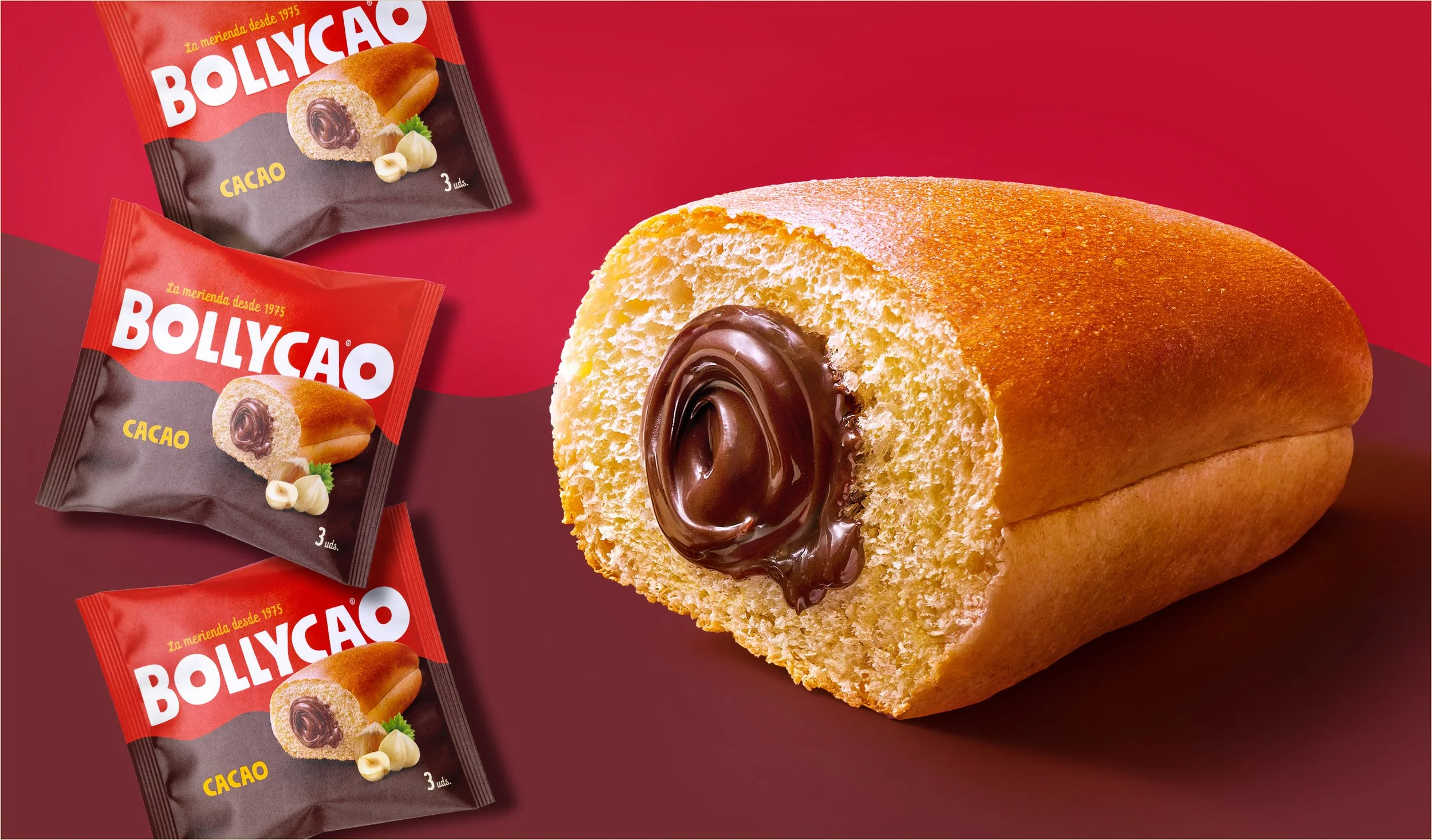
That shapes how you shoot. The same frame appears printed a few centimetres wide on the wrapper film and over a metre tall on a backlit street poster, and in each place against a different ground: the red wave of the pack, a warm gradient, a dark surface. Every destination called for its own adaptation of scale, cut-out and background, but all of them start from the same capture, shot from the outset to allow for it.

It is also what makes the investment add up. An image built this way goes on being used long after the campaign it was made for, and in places nobody had in mind on the day of the shoot. One of them ran in the joint campaign with Nocilla, another Spanish brand with a following of its own, where the image had to share the frame with a second identity.

Working for a brand half of Spain knows by heart carries an added responsibility.

We like it that way.

Bollycao & Nocilla “La combi perfecta” campaign

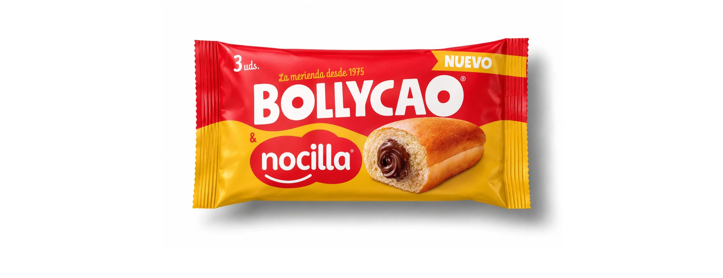
Bollycao & Nocilla packaging

Bollycao Croissant al Cacao packaging image

Bollycao Original and Croissant al Cacao packagings

Bollycao “No se comparte” campaign

Bollycao packaging image

all case studies


Featured Posts

Summary Block
This block is invalid. Please check the block settings and try again.
Featured
Vulputate Commodo Ligula
November 22, 2026
Vulputate Commodo Ligula
November 22, 2026

Commodo cursus magna, vel scelerisque nisl consectetur et. Donec id elit non mi porta gravida at eget metus.

Read more →
November 22, 2026
Elit Condimentum
November 15, 2026
Elit Condimentum
November 15, 2026

Lorem ipsum dolor sit amet, consectetur adipiscing elit. Vestibulum id ligula porta felis euismod semper.

Read more →
November 15, 2026
Aenean eu leo Quam
November 8, 2026
Aenean eu leo Quam
November 8, 2026

Quisque iaculis facilisis lacinia. Mauris euismod pellentesque tellus sit amet mollis.

Read more →
November 8, 2026
Cursus Amet
November 1, 2026
Cursus Amet
November 1, 2026

Sed purus sem, scelerisque ac rhoncus eget, porttitor nec odio. Lorem ipsum dolor sit amet.

Read more →
November 1, 2026
Pellentesque Risus Ridiculus
October 25, 2026
Pellentesque Risus Ridiculus
October 25, 2026

Vivamus pellentesque vitae neque at vestibulum. Donec efficitur mollis dui vel pharetra.

Read more →
October 25, 2026
Porta
October 18, 2026
Porta
October 18, 2026

Praesent id libero id metus varius consectetur ac eget diam. Nulla felis nunc, consequat laoreet lacus id.

Read more →
October 18, 2026
Etiam Ultricies
October 11, 2026
Etiam Ultricies
October 11, 2026

Donec id justo non metus auctor commodo ut quis enim. Mauris fringilla dolor vel condimentum imperdiet.

Read more →
October 11, 2026
Vulputate Commodo Ligula
October 4, 2026
Vulputate Commodo Ligula
October 4, 2026

Commodo cursus magna, vel scelerisque nisl consectetur et. Donec id elit non mi porta gravida at eget metus.

Read more →
October 4, 2026
Elit Condimentum
September 27, 2026
Elit Condimentum
September 27, 2026

Lorem ipsum dolor sit amet, consectetur adipiscing elit. Vestibulum id ligula porta felis euismod semper.

Read more →
September 27, 2026
Aenean eu leo Quam
September 20, 2026
Aenean eu leo Quam
September 20, 2026

Quisque iaculis facilisis lacinia. Mauris euismod pellentesque tellus sit amet mollis.

Read more →
September 20, 2026